
Excel Chap 2 – Beyond the Basics
- Absolute versus Static References
- Understanding Complex Formulas
- Date & Time Functions
- Logical Functions
- More Math Functions
- Sorting and Filtering
- Conditional Formatting
- Pie Charts
- Bar & Column Charts
- Line Charts
Absolute versus Static References
One of the first things that new Excel users need to realize is that Excel is so much more powerful than a calculator. Some users insist in setting up a worksheet as if it is merely a calculator. These people fail to realize the power of cell references. Instead they use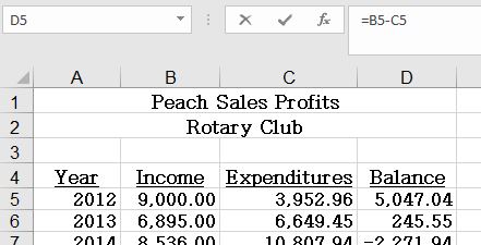 static references to constant values. A static reference is a reference to a value that does not change. In the example to the right, instead of using static references (= 9000-3952.96) for the formula in D5, the user should employ cell references. (= B5-C5). The main benefit of use cell references is that the user can manipulate the input values in columns B and C, and the formulas in column D will remain accurate. If the user changes either input values in columns B or C with static references, the formulas in column D will need to be manually updated.
Cell referencing is an extremely useful feature when formulas need to be copied across ranges in a worksheet. When creating formulas that contain references to cells or cell ranges, the default cell reference is considered to be a relative cell reference. When formulas with these type of cell references are copied to other cells the formulas will automatically change relative to the cells that they are copied to. However, there may be instances where it is necessary for Excel to keep the exact cell referenced in a formula when copying to other cells. A cell reference that does not change when copied is called an absolute cell reference (sometimes called a fixed cell reference). The indicator that a cell reference is absolute is the presence of a dollar sign symbol in front of both the column letter and row number, such as $A$3. To create an absolute cell reference, either type the dollar sign manually, or press the F4 after entering the cell reference. Repeatedly pressing the F4 key cycles the reference through the four different combinations of relative, absolute, and mixed cell references.
Mixed cell references are a combination of relative and absolute: either the column is relative and the row fixed (absolute), for example D$2, or the column is fixed and the row relative: $D2. Mixed cell references are rarely used, but they play a significant role when it is necessary to keep a single row or column unchanged while copying the formula. Mixed cell references are commonly used when creating a table of values, like a multiplication table or a mortgage rate table.
Whenever possible, utilize relative and/or absolute references instead of static cell references. 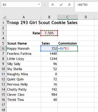 In the worksheet at the right, the formula in C6 is using relative cell references to both the Sales amount (B6), and the Commission Rate (B3). Unfortunately, if this formula is copied (perhaps by using the fill handle) to rows 7:16, the resulting formulas will be wrong. Some cells will display zeros or a #VALUE! error, while others will display inflated amounts because the Rate percentage is being replaced by higher sales values. Therefore, the reference to B3 in the formula should be an absolute cell reference, i.e. =B6*$B$3. It may be tempting to construct the formula using a static reference to the constant value of .075 (i.e. =B6*.075). However, if the rate needs to be changed to 7.25%, the formulas with the static references would each need to be changed manually. Conversely, if the formulas in column C are using absolute cell references to $B$3, a single edit to B3 is all that is needed to update all of the cells in column C. Knowing the differences between the various type of cell reference will make the worksheet more scalable and flexible for future expansion.
Understanding Complex Formulas
Formulas can be simple mathematical formulas or complicated formulas involving multiple mathematical operations, multiple cell ranges and nested functions. While it is a good idea to remember the order of operations rules, complex formulas can use parentheses to identify the arguments of functions and to override the order of operations. In mathematical operation formulas, operations within parentheses are performed before those outside of it. For example, in =A3+B3*C3, B3 is multiplied by C3 before A3 is added to the result, but in =(A3+B3)*C3, A3 and B3 are added together first, then the result is multiplied by C3.
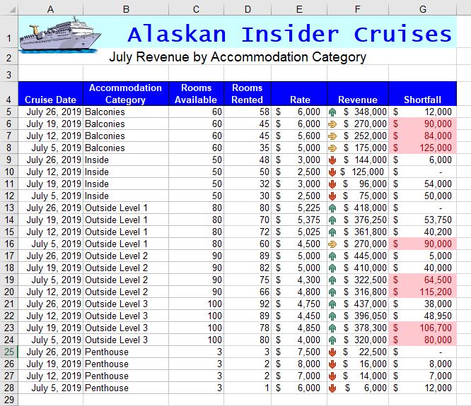
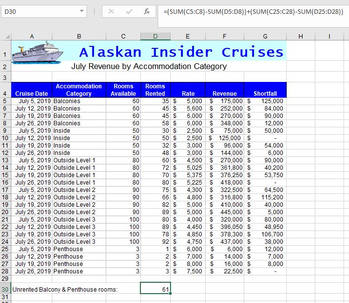
Parentheses in operations may be nested inside each other. The operation in the innermost set of parentheses will be performed first. Whether nesting parentheses in mathematical operations or in nested functions, always be sure to have as many closed parentheses in the formula as there are open parentheses, or Excel will return an error message. In the illustrated worksheet below, cell D30 contains a complex formula that calculates the differences between rooms available and rooms rented to determine the total number of unrented rooms in the Balcony and Penthouse categories. The formula in D30 is: =(SUM(C5:C8)-SUM(D5:D8))+(SUM(C25:C28)-SUM(D25:D28)). Notice the number of open and closed parenthesis!
Date & Time Functions
Excel can produce the current date and/or time, based on the computer’s regional settings. Excel can also add and subtract dates and times. For example, it may be necessary to keep track of how many hours an employee worked each week, and calculate their pay and overtime. There are numerous Date and Time functions in Excel to help calculate the addition or difference between dates or times. Excel stores all date and time values as sequential serial numbers. For example, January 1, 1900 is represented by the serial number 1, and January 1, 2020 is represented by serial number 43831 because it is 43,831 days after January 1, 1900. To view the serial number of an existing date, format the date using the General Number format. The conversion of dates and times to serial numbers simplifies the process of using dates and times in calculations. The key to displaying the results of these calculations it using the appropriate Number format, which may require diving into the world of creating custom number formats to display only days, hour and/or minutes. For example, if only the number of years is desired to be displayed when calculating the difference between two dates, the Custom Number format should be yy.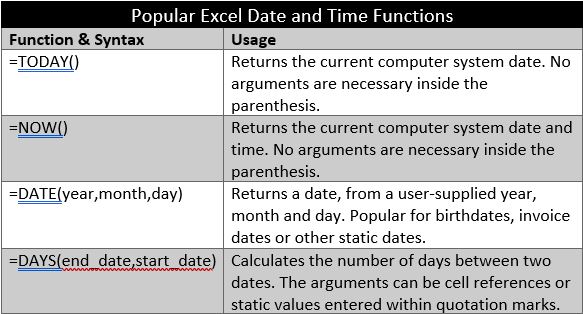
The TODAY and NOW functions are very similar since both return the current system date. However, the NOW function also returns the current system time. Many users format the results of the NOW function to only display the current system time. One characteristic of these functions versus the DATE function is that TODAY and NOW are volatile functions, so if the workbook is opened tomorrow, these functions will update automatically, whereas the DATE function will not change. These functions are for use within the grid of the worksheet, typically to calculate durations. There are separate Date and Time fields for use in worksheet headers and footers.
Logical Functions
Many employers and educators are placing increasing emphasis on the value of critical thinking. Critical thinking skills are often associated with problem solving skills, empathy, and thinking and acting in purposeful ways by making fact-based decisions. Excel is a practical tool for collecting and analyzing data critically. Excel’s logical functions are especially useful for enabling critical thinking. However, before exploring the utilization of Excel’s logical functions, it is necessary to review the logical operators that are used to compare data between cells. The operators are often referred to as comparison operators. The six main logical operators are explained in the following graphic:
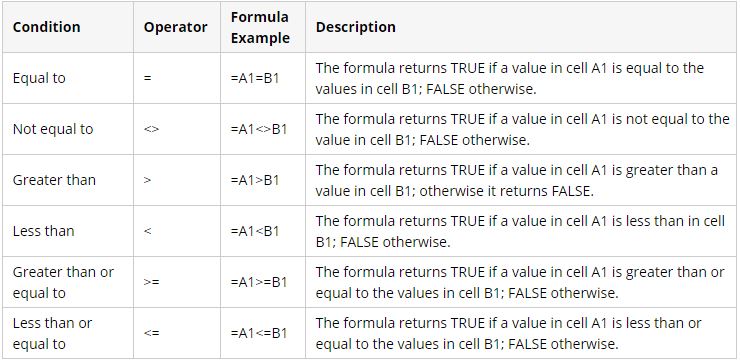
These comparison operators can be used in Excel functions to compare all types of data, including dates, numbers, Boolean values (True or False, Yes or No), or text. All arguments must evaluate to the Boolean values of either True or False, or contain another, nested logical function.
The IF function is one of the most popular and useful functions in Excel. It can be used to make a decision based on a comparison. If the comparison is true, one value is displayed in the cell; if the comparison is false, a second value is displayed. The syntax of the IF function is: IF(logical_test, [value_if_true], [value_if_false]).
-
-
- logical_test – a value or logical expression that can be either TRUE or FALSE. Required.In this argument, you can specify a text value, date, number, or any comparison operator.
- value_if_true – the value to return when the logical test evaluates to TRUE, i.e. if the condition is met. Optional.
- value_if_false – the value to be returned if the logical test evaluates to FALSE. Optional.
-
Simple IF functions test to see if a cell contains a certain text string, and returns different 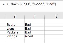 values depending on if the logical test returns a True or False logic. A sample formula is illustrated in the screenshot at right. That’s some logical critical thinking!
Instead of returning text strings, the IF formula can test the specified condition, perform a corresponding math operation and return a value based on the result. This is done by using arithmetic operators or other Excel functions in the value_if_true and /or value_if_false arguments. For example, =IF(C4>=D4, E4*.25, E4*10%). This formula is determining if the value in column C is greater than or equal to the value in column D. If the result of the comparison is true, then the value to be displayed should be the value in column E multiplied by .25 (25%). If the result of the comparison is false, then the value to be displayed should be the value in column E multiplied by 10% (.10).
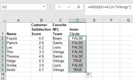
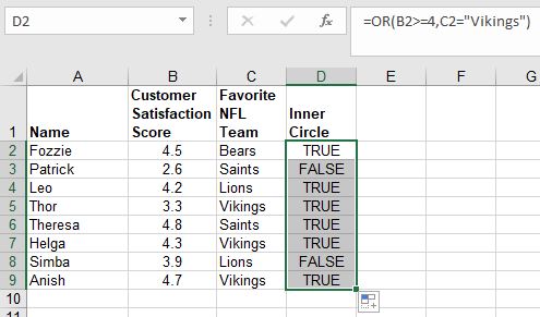
Other popular Excel Logical functions include the AND, as well as the OR functions. These functions allow users to create multiple logical tests within a single IF function. These functions return either TRUE or FALSE results when their arguments are evaluated. The AND function only returns TRUE if every condition is met. However, the OR function returns TRUE if any condition is met. The syntax of both functions are the same: =AND(logical1, logical2, etc.) Examples of each function are illustrated in the screenshots below. The first illustration uses the AND function to determine if any of the people are eligible for the Inner Circle. They need to have a Customer Satisfaction Score of at least 4.0, and be a Vikings fan. The second example uses the OR function. The more lenient comparison operator yields more eligible people for the Inner Circle.
More Math Functions
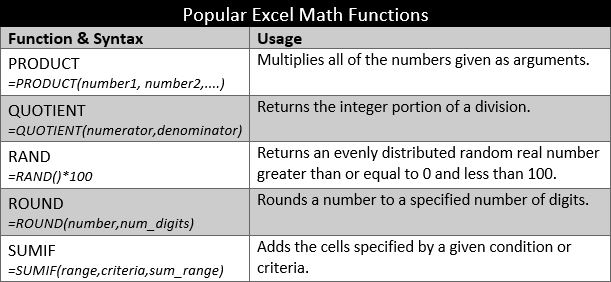
The most popular Excel function in the Math category is undoubtedly the SUM function. The Excel Math Functions perform many of the common mathematical calculations, including basic arithmetic, conditional sums & products, quotients, and rounding calculations. There are many more examples, but some of the more popular Math functions are identified in the table below. There are many variations of some of these functions to be found in the Insert Function window.
The first two functions from the table above are considered basic mathematical operations. Instead of multiplying two cells using the * operator, Excel users can opt to use the PRODUCT function. i.e. =PRODUCT(B2,B3) versus =B2*B3. The PRODUCT function is most useful when multiplying a series of cells. Ensure that the cells referenced contain numbers or dates. If the data referenced includes text, the PRODUCT function will return the #VALUE! error result. The QUOTIENT function is similar to 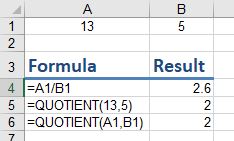 the PRODUCT function, except instead of multiplying cells, it divides cell(s) by other cell(s) and returns a result in Integer format. An integer is a whole number, therefore it will not display the remainder typically generated in division calculations. The graphic at right illustrates the differences between using the divide operator and the QUOTIENT function. The numerator is the dividend and is the value before the forward slash (/). The denominator is the divisor, and is the value after the forward slash (/). In this example, A1 (or 13) is the dividend, and B1 (or 5) is the divisor.
An alternative to using the QUOTIENT function is to utilize the ROUND function or any of its related functions (ROUNDDOWN, ROUNDUP,MROUND). In the graphic above, a user could rewrite the formula in A4 as =ROUND(A1/B1,0) by using the ROUND function to get the similar results as the QUOTIENT functions. The difference is that the 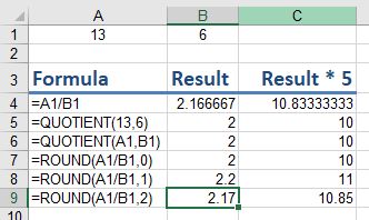 QUOTIENT result does not store any remainder amounts. As shown in the graphic at the right, using the ROUND function can yield significantly different results than using the QUOTIENT function, however, the user can control the level of detail desired in the calculation. Some users simply opt for the first scenario without using either functions. Instead, they utilize Excel’s formatting functionality to remove the displaying of decimals. Using the Decrease Decimal button
 ![]() from the ribbon on cell B4 can change the display to various results. However, the un-truncated/un-rounded result is still stored in the cell.
from the ribbon on cell B4 can change the display to various results. However, the un-truncated/un-rounded result is still stored in the cell.
Practice 7: Expense Report
- Create the a new worksheet with the following data from the image below:
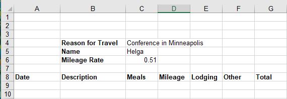
- In row 9 enter the following data:
- Date: 5/30/2019
- Description: Travel to Minneapolis
- Meals: 25
- Mileage: 205
- Lodging: 150
- Other:
- In cell G9 enter the following complex formula using relative and absolute cell references: =C9+(D9*$C$6)+E9+F9 (are the parenthesis necessary?)
- Format columns C, E, F and G as Currency format with two decimals.
- Enter the following in row 10:
- Date: 5/31/2019
- Description: Travel home
- Meals: 20
- Mileage: 205
- Lodging:
- Other: 15
- Use the fill handle to copy the formula in G9 to G10.
- Insert a new row below the Mileage Rate row, and in B6 enter the label: Trip Duration. (bold the label)
- In cell C6 enter a formula that subtracts A9 from A10. Change the format of cell C6 to General.
- In cell B15 enter the label: Totals: (right-align & bold this cell).
- Select cells C15:G15 and click the AutoSum button. Change the format of D15 to General.
- Enter the label: Need Receipts? in cell B2. (bold the label)
- In cell C2, enter the following logical function: =IF(F15>0,”Yes”,”No”)
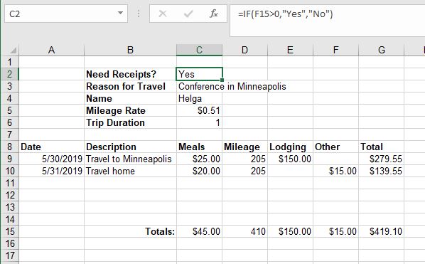
- Save the file as Helga Expenses May2019. Your worksheet should resemble the following:
Sorting and Filtering
Worksheets can have large amounts of data, and it can be overwhelming if it is not sorted correctly. Arranging data in a specified order is called sorting. Rows can be sorted in either ascending (low to high) or descending (high to low) order. Ascending order can also be considered alphabetic order if the data is text or chronological order if the data is dates or times.
Before data can be sorted, Excel needs to know the exact range of cells that is to be sorted. Excel will select areas of related data as long as there are no blank rows or columns in the data range. Blank rows and columns define the outer limits of the data range. To ensure that the correct data is selected, highlight the range before starting the sort.
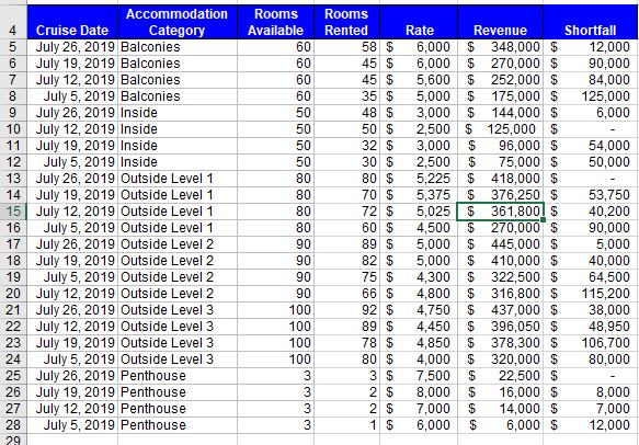
As Excel determines the defined range of data to be sorted, Excel also determines if field names exist. Users should format the first row of the data range with unique formatting Often, just making the labels bold will help Excel identify the field names. Identifying the field names will prevent Excel from including these fields in the records to be sorted. The field names become the sort keys needed for multiple column sorts. In the image below, the possible sort keys are: Cruise Date, Accommodation Category, Rooms Available, Rooms Rented, Rate, Revenue and Shortfall.
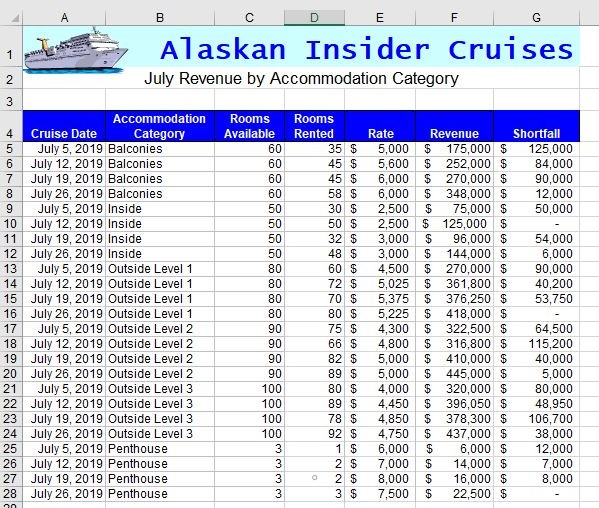
The data range above is already sorted in ascending order by the Accommodation Category key field. A single column sort is quite easy. Simply click any cell in the column that represents the key sort. In the above example, any cell from B4 to B28 would be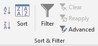 acceptable. Then, click the the A-Z option in the Sort & Filter group of the Data tab. The entire row is sorted because each row is a record that should stay grouped together. Be careful NOT to select a single column of data or the records may not be kept together. Excel will warn the user with a warning message. If the user chooses to Continue with the current selection, only the data in the column with change their order, while the data in the other columns remain unchanged. This will most likely destroy the integrity of the data.
Advanced sorting involves multiple key fields from multiple columns. A multi-level sort can be set up by clicking the Sort button from Sort & Filter group from the Data tab (or the Sort & Filter button from the Editing group of the Home tab and choose Custom Sort) to open the Sort dialog window. The first sort criteria, also known as the primary sort, was previously defined to sort by Accommodation Category in ascending order. To 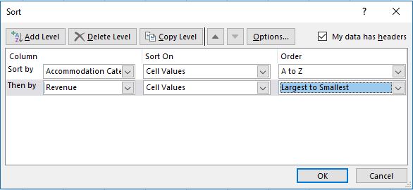 add a second level, also known as a secondary sort, click the Add Level button. After entering additional sort criteria, additional levels can be added. As shown in the graphic to the right, secondary criteria has been added to sort in descending order by Revenue. The data in column B will not appear to change, but the records will reorder. Compare the results below with the table above.
An Excel filter, also known as an AutoFilter, is used to display only the data that meet specific criteria. Data that does not meet the criteria is hidden from view. Excel’s basic filter functionality allows users to filter rows by value, by format and by criteria. Filters can reduce a large, complex worksheet of data into meaningful information. With filtering, you can control not only what you want to see, but what you want to exclude. Users can filter based on choices they make from a list, or they can create specific filters 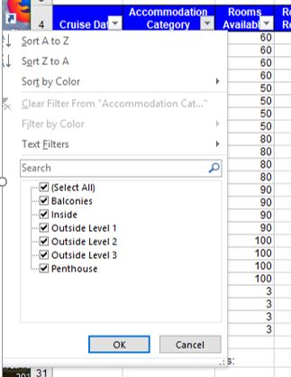 to focus on exactly the data that they want to see. Clicking the filter button from the Data tab will add drop-down arrows to the column headers in a range of data. Clicking a drop-down arrow provides sorting and filtering options, like filter by color or text filters. A simple AutoFilter will be signified by the clearing of check boxes of the data that should be hidden. After applying a filter, a user can copy, edit, chart or print only visible rows without rearranging the entire list. Like sorting, filters can be applied to multiple columns to further reduce the results that are displayed.
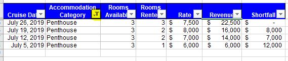
A column that has been filtered will have its drop-down arrow icon switch from an upside-down triangle to a filter icon, as shown highlighted in yellow below. Only the cruises from the Penthouse accommodation category will be displayed after clearing all check boxes except the Penthouse category.
To remove a single filter, click the filter icon in the row header and choose Clear Filter from…. To clear all filters quickly, choose the Clear button from the Data tab on the ribbon or to remove filtering functionality, re-click the Filter icon from the Sort & Filter group. For more advanced users there are many more ways to utilize filters in Excel, such as Custom Filters and Advanced Filters. Nonetheless, a lot can be accomplished with the basic AutoFilter feature.
Conditional Formatting
Using spreadsheet functionality to enhance critical thinking is a primary reason that Excel is so popular among business professionals. Decision-making is made easier when users can quickly spot trends, identify variances, and be alerted when certain criteria is met. Excel’s conditional formatting feature is a really powerful tool when it comes to applying different formats to data that meets certain conditions. Conditional formatting is one of the most simple yet powerful features in Excel by applying user-specific formats to a cell/cells when user-specific conditions (rules) are met. Not only does it make a spreadsheet look awesome, but it also helps make sense of the data.
![]()
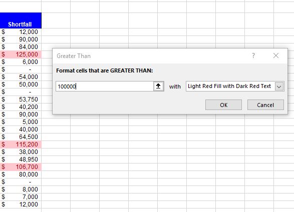
Clicking the Conditional Formatting button on the Home tab of the ribbon offers several options to define the condition criteria (rules), and several formatting options to display the data in meaningful ways. To choose 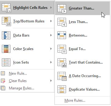 formats that are applied to a cell(s) when a condition is met, select a range of cells, then click the Conditional Formatting button to display a menu of rules. Clicking a rule will expand an additional menu. For example to identify which cruise accommodation categories provide the most significant revenue shortfall, utilizing a highlighting rule that formats cells that are greater than $100,000 would be a very practical conditional formatting rule that could provide some strategic information. Selecting the range of G5:G28 and applying the Greater Than rule, will create eye-catching formatting. The data in the first field can either be a cell reference or a static value, as shown below.
Numerous rule types exist beyond the preset comparison operator menu choices. Rules can identify cells that contain certain text or before/after a certain date, or even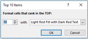 highlight duplicate data. Top/Bottom Rules can reveal the top or bottom 10 records in a certain column. The quantity can be modified from the top/bottom 10 to a user-specific number.
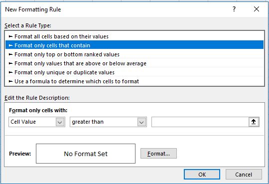
Custom rules can be defined by choosing More Rules… from the Highlight Cells Rules menu, which opens the New Formatting Rule window. Choosing alternative Rule Types will modify the functionality available in this window.
After defining the rule criterion, custom formats can be selected by clicking the Format button. The Format Cells window opens to allow custom Number, Font, Border or Fill formatting. To enforce more complex rules, multiple conditional formatting rules can be applied to the same data. However too many colors can sometimes be distracting, and should be used sparingly. Therefore, Excel offers more formatting choices than just color ![]() fills. Data bars, color scales and icon sets can also be used to emphasize data that meets certain conditions.
fills. Data bars, color scales and icon sets can also be used to emphasize data that meets certain conditions.
The icon sets work great when color is not effective, such as when printing to black & white laser printers. Icons are even more noticeable than colors because of their unique look and sparing use. Icon sets will help visually represent the data with directional arrows, shapes, indicators, ratings, and other objects. For icons in sets of three, Excel will assign icons by dividing values into thirds – the first icon is assigned to the top one third of values, the second icon is assigned to the second third of values, and the third icon is assigned to the lowest one third of values. The values are adjusted for four and five-icon sets. Conditional formatting’s flexibility is extensive, but perhaps even more impressive is that, like formulas, conditional formatting rules are volatile. As the data changes, the conditional formatting dynamically adjusts to evaluate the new data against the existing conditional rules.
Pie Charts
With Excel, users can organize data so that it has context and meaning. The output of Excel manipulation can take the shape of either a table or chart. When deciding to use a chart or a table to communicate the data-driven message, it is wise to always ask how the information will be used, and who is the audience? People interact very differently with these two types of visuals. Tables, which display data in a columnar layout, are meant to be read. Therefore tables are ideal when the data requires more specific analysis. Tables offer preciseness, letting users dive deeper to crunch the numbers and examine exact values, instead of focusing on approximations or visualizations.
A chart is a visual representation of a range of related worksheet data. A chart can illustrate a large amount of numerical data quickly and in an easy-to-understand fashion. Charts are particularly useful for simplifying complex sets of data to expose the shape of the data – numerical patterns, trends, and other significant activity. What charts lack in terms of precision they overcome with broader insight and quicker comprehension.
According to some psychologists, people can be classified as either “left-brained” or “right-brained” thinkers. A person who is “left-brained” is often said to be more logical, analytical, and objective. Utilizing tables to display spreadsheet data may be more effective with “left-brained” people. A person who is “right-brained” is said to be more creative, thoughtful, and subjective. Conversely, displaying spreadsheets data using certain Excel charts may be more suitable for “right-brained” people. Both tables and charts offer unique advantages, but one is not always better than the other. The choice ultimately depends on the data at hand, the message that is intended to convey, and the audience that will be consuming the information.
Learning how to work with charts means not only knowing how to create them but also realizing that different types of chart and layouts can reveal and emphasize different knowledge. Like a picture, a chart can be worth a thousand words. It all depends on how well the chart is designed and developed. A well constructed chart will provide context and clarity for data analysis and story telling. The first step to creating useful charts it to organize and precisely select the data that should be charted. This includes the cells that contain both the data and the label headings.
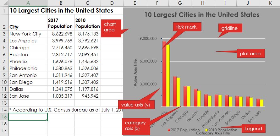
Each chart type conveys information in different ways. Pie charts, for example, are best for charting data that is a percentage of a whole. For example, what percentage of your monthly income is spent on transportation? Charts contain different objects for each chart type. Objects in a pie chart include:
-
-
- Chart title – describes what is charted. The label heading of the data series is used by default, but this can be edited.
- Legend – an index of information that corresponds to the category labels.
- Data labels – identify each value in the data series.
- Plot area – the part of the chart that displays data graphically.
- Chart area – the entire chart and all of its elements.
-
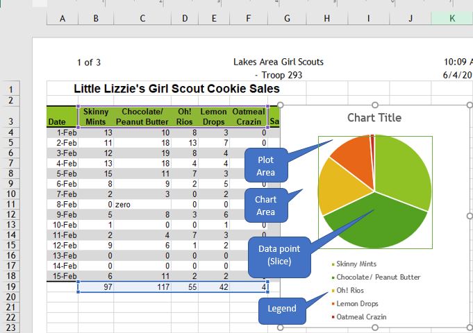
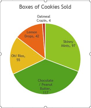
A pie chart can only include a single series of data, whether it is a single column or a single row of data. A data series is the sequence of values that Excel uses to plot in a chart. Each value from the data series is represented by a slice (or wedge) of the pie. The size of each slice varies with its percentage of the total of the entire data 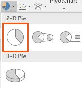 series. To create a pie chart, first carefully select the appropriate data range before selecting the chart type from the Insert tab. In the above chart, the selected data range is $B$3:$F$3, $B$19:$F$19, since the only data series being charted is the total sales (quantity) of each cookie flavor. Every date (row) represents an additional data series, but since pie charts only plot a single data series, these series’ should not be selected. Pie charts should be avoided when there are many categories, or when categories do not total 100%. Typically, 2-D charts are easier to read than 3-D charts.
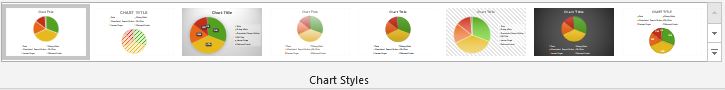
When a chart is created as an object on a worksheet, sizing handles will appear on the outer borders. The chart, or any object within the chart, can be moved and/or resized similarly to a picture or other objects in Microsoft Office. When a pie chart is first created, Excel will use the default colors and design. Users can customize the chart look easily by utilizing chart styles. In the Design contextual tab of the Ribbon, a number of different styles will be displayed in a row. Mouse over them to see a preview:
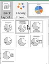
An additional option for quickly changing the look of a chart is to utilize the Quick Layout menu to select one of several preset to add elements like percentage labels, value labels, and differently 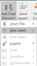 located legends to the chart. Users can also add and remove individual elements, such as chart titles, data labels, data tables, and more by using the Add Chart Element menu. Some elements are not available for certain chart types. One of the most useful chart elements that get added manually to a chart are data
 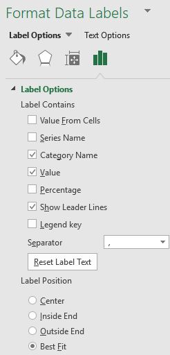 labels. Data labels are linked to values on the worksheet, and they update automatically when changes are made to these values. Data labels make a chart easier to understand because they show details about a data series or its individual data points. Users can add data labels to all data points or a specific data slice by ensuring that only the specific slice is selected. In addition to the Add Chart Element menu and quick layout options, users can add data labels by right-clicking the chart and choosing Add Data Labels from the shortcut menu. Once added, the data labels can be further modified by right-clicking the chart and choosing Format Data Labels to open the Format Data Labels task pane. One or more types of labels can be added and positioned. Adding Category Name labels make the legend redundant. Be careful not to add so many labels that the chart becomes too crowded to read!
After adding labels, it may become necessary to resize or move the chart. After adding a title, data labels, and removing the legend, the chart looks different, but is still the same size, even though certain elements have resized.
Which pie chart looks better? Generally, removing the legend through use of data labels is considered a preferable design strategy. Alas, there are even more ways to customize a pie chart that is beyond the scope of this text! Additional functionality includes creating 3-D pie charts, exploding slices, rotating, sorting, adding different fill designs, and much more!
Bar & Column Charts
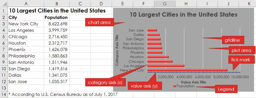
Bar charts are practical for comparing the differences between values with horizontal bars. The lengths of the bars are proportional to the size of the data category they represent. A vertical bar chart is referred to as a column chart, and they are basically the same – just 90° apart. Unlike a pie chart, a bar chart can include several series of data. Bar charts are simple, easy and flexible, and thanks to the horizontal layout, bar charts can accommodate longer category names. Bar (and column) charts contain the following objects:
-
-
- Chart title – describes what is charted.
- Chart area – the entire chart and all of its elements.
- Plot area – the region within the horizontal and vertical axes.
- Axes titles (horizontal, vertical)- describe the data.
- Legend – an index of information that corresponds to the series names.
- Data labels – identify each value in a data series.
- Value axis (y-axis) – contains values. Horizontal axis on bar charts and vertical axis on column charts.
- Category axis (x-axis) – contains the category labels. Horizontal axis on column charts and vertical axis on bar charts.
- Gridlines – mark the intervals on an axis.
-
While the data and chart above only displays one data series, most bar and column charts tend to display multiple data series to compare and contrast one set of data against another. The chart below adds a second data series in column C, and changes the chart type to a column chart. The two different data series are illustrated with different color data points. Also, note how the axes change directions! The value axis maximum, major and minor units were also modified to different numerical values.
Charts can easily get crowded with details. Therefore, keeping the chart on the same worksheet as the data is not always feasible. Users can move a chart to any location on a worksheet or to a new or existing worksheet. By default, a chart is created as an object within a sheet. The chart can be resized, but sometimes the chart needs to be as large 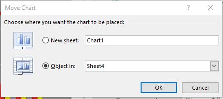 as possible. To move the chart to a new worksheet, click the Move Chart button on the Chart Tools Design tab. Next, click the New sheet radio button, and then in the New sheet box, type a name for the new worksheet. After clicking OK, the new sheet will be to the left of the existing sheet. A new, standalone chart will occupy the entire page to maximize the visibility of the data. The Move Chart window also provides the option of moving the chart as an embedded object into an existing sheet.
Line Charts
A line chart displays a series of data points connected by a straight line. Line charts are a good way to show change or trends over time. Line charts are simple to create and easy to read. In contrast to column or bar charts, line charts can handle more categories and more data points without becoming too cluttered. Each line displays as a different color. Line charts help people examine why data is changing and make decisions about how to 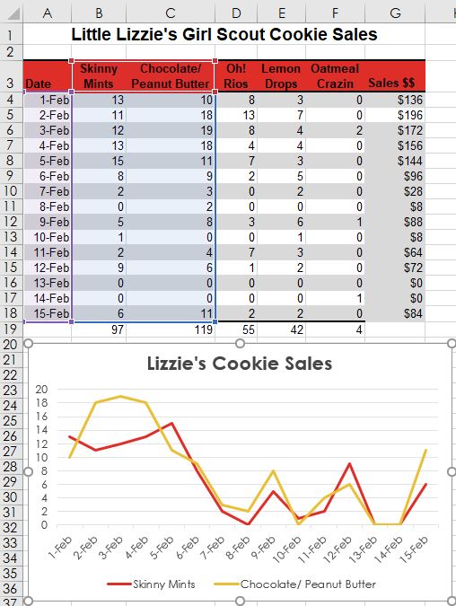 proceed. The Line Chart is especially effective in displaying data trends. Stock market investors utilize line charts to track historical stock performances, and help determine if a trend can be forecasted in the future.
In a Line Chart, the vertical axis (Y-axis) always displays numeric values and the horizontal axis (X-axis) displays time or other categories. Time intervals can be measured in years, months, days, or hours.
To create a line chart, start by selecting the data range, then choosing the Line Chart button ![]() in the Charts group from the Insert tab.
in the Charts group from the Insert tab.
In the 2-D line chart illustrated above, two sets of data series are plotted for fifteen days. The Skinny Mints cookies are identified by the red line, and the orange line plots the Chocolate/Peanut Butter cookies. Each date is a data point. Additional data series can be added by expanding the data source range. Line charts provide an easy way to track historical data. In many cases, the way the data is trending makes it easy to predict the results of data in future periods.
Excel offers numerous other charts that might better help illustrate the story behind the data, however all charts must address the challenge of sharing or outputting the graphic(s) to their target audience(s). Here are a few printing issues to consider:
-
-
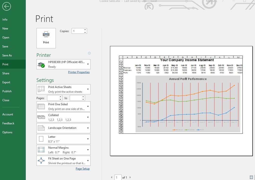
- Printing only the chart. If the active cell is not selecting the chart, both the chart and worksheet data will print. However, if the chart is currently selected, only the chart will print by default (as a chart sheet). If the intent is to print both the chart and the data, make sure to move and/or resize the chart to ensure everything fits appropriately within the sheet margins. This will embed the chart within the sheet. Utilizing the Print Preview window to verify what will print by default will allow the user to make numerous changes, such as the orientation, margins and scaling. A different installed printer can also be selected. The graphic below illustrates from the Print Preview window, an embedded line chart in landscape orientation with headings enabled for print. The sheet has also been scaled to fit to one page.
- Chart colors that are not compatible with black and white printers. A lot of office printers are black and white laser printers due to their low-cost to operate at high volumes. A color laser printer may be a worthy investment for common chart printing. If a black and white printer is all that is available, it may be necessary to change the colors to patterns or contrasting shades of grey.
- Not enough or too much information. Reads of the chart must be able to comprehend the message the chart is attempting to convey. This might require adding context, such as titles, data labels, and text-box callouts. Conversely, a chart can have too much information that the chart is cluttered and unreadable. In this case, summarizing the data my be prudent, or even re-selecting a different source data range. A chart can also be unreadable due to poor design considerations like wrong fonts and font sizes, as well as distracting colors and object sizes.
- Excel charts are volatile and will change as often as the source data is changed. If a static copy of a chart is needed, consider saving the chart as a picture. This can be accomplished through using the copy and paste special commands. Using Paste Special will allow a chart to pasted in either PNG, JPEG, GIF or other formats. Alternatively, Excel files can be saved as PDF files for inserting in other electronic documents/files.
- Printing only the chart. If the active cell is not selecting the chart, both the chart and worksheet data will print. However, if the chart is currently selected, only the chart will print by default (as a chart sheet). If the intent is to print both the chart and the data, make sure to move and/or resize the chart to ensure everything fits appropriately within the sheet margins. This will embed the chart within the sheet. Utilizing the Print Preview window to verify what will print by default will allow the user to make numerous changes, such as the orientation, margins and scaling. A different installed printer can also be selected. The graphic below illustrates from the Print Preview window, an embedded line chart in landscape orientation with headings enabled for print. The sheet has also been scaled to fit to one page.
-
Practice 8: Weather Report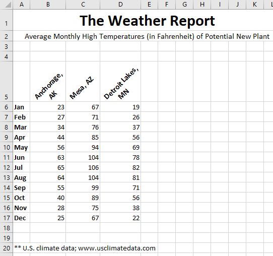
- Open the data file The Weather Report.xlsx or create a new sheet from the illustration at right.
- Add conditional formatting to all cells in B6:E17 so that any cell is at least 90° with red fill cell formatting, or below 32° in light blue fill.
- Use the Internet to research average monthly high temps for Fort Myers, FL. Enter a label and the temps in column E. The conditional formatting should dynamically format the cells.
- Create a 2-D bar chart of Anchorage and Mesa temps for all twelve months.
- Move the bar chart to its own chart sheet.
- Return to the original source data sheet and create an embedded 2-D line chart with markers for all four cities for all twelve months. Change the chart title to Average Month High Temps. Move the chart slightly so the top-left edge is in cell F6.
- Use Print Preview to view the entire sheet (not just the chart). Change the orientation to landscape. Compare your results with the screenshot below:
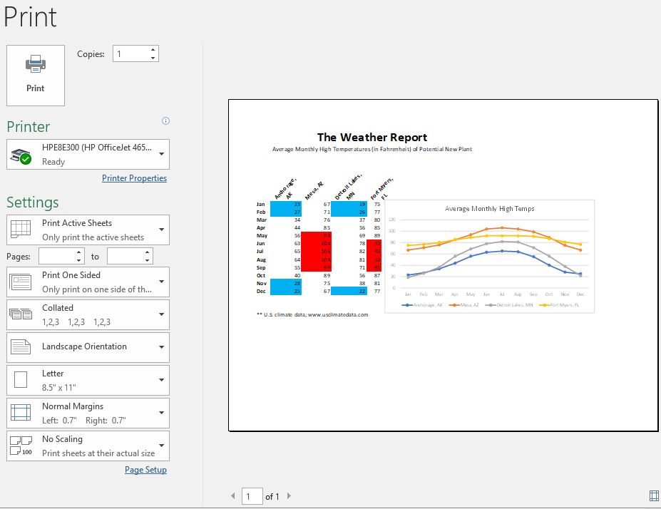
- Save the file as The Weather Report2.xlsx to your hard drive.
