
2 Live Sessions
The focus of our sessions was discussion and practical exercises rather than lectures. We asked participants to come prepared to explore, debate, and experiment.
During our July 6 Session
Key activities were:
1 – Discuss chapters 1-6. One participant had an interesting question about what stories we want to tell versus what our stakeholders want to hear.
2 – Follow up on the discussions already begun in D2L Brightspace and help each other decide on topics and best visualizations. Jill outlined her process:
- Explore data (sort columns up and down, try different charts with different fields)
- Note: Software rarely does something good on its own
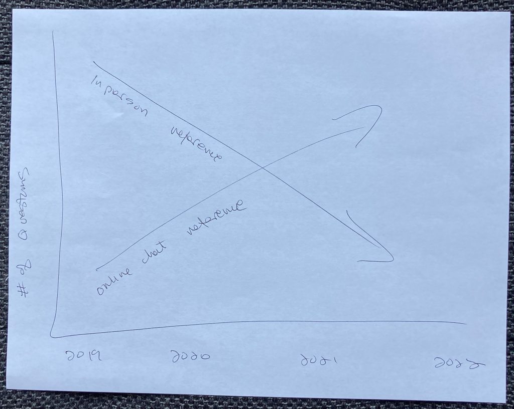
- Draw what she thinks would be a good representation of what is happening, for example:
- Figure out how to make the software do something reasonable
- Different tools have strengths and weaknesses depending on your goal (Alma Analytics, Excel, Power BI, PowerPoint, Canva, etc.)
Tips for everyone:
- Make it focused and simple
- Label everything really well
3 – Begin storyboarding our presentations, similar to Figure 6.12 from page 179 in the book. For example:

In this example, Jill shared the data story she was working on:
- Setting & Hook – Number of students decreasing
- Rising Insight – Increasing percentage of people of color (POC)
- Rising Insight – Lower graduation rate of POC
- Aha Insight – Loss of students could lead to funding problems, which could lead to campuses closing
- Next Steps – Options to improve student success:
- OER and textbook affordability initiatives
- Create more inclusivity and belonging
We like to end each session with a reflection activity where participants share their favorite learning and record key points. Here is what they said for our July 6 session:
Key Points
- People don’t remember and frequently don’t care about facts.
- Just pick a topic
- Psychology of communicating data, types of data visualizations
- Data visualization and storytelling are both extremely simple and layered /complex.
- Some of the intangibles DO actually have numbers to tell the story.
- Keep it small!
- Keeping topic small, looking at different types of visualizations that may go better with my data
- Group can help unfuddle the stories that are good to tell.
Favorite Thing I Learned Today
- Focus on individual people, rather than minute changes in percentages.
- Keep it simple
- I learned a lot about ways to think about gathering data, even if my institution doesn’t have it
- The storyboard exercise helped me see aspects of my story that were invisible to me before.
- I learned about panel line charts and I also enjoyed giving/receiving feedback and how we can all relate to each other, despite the topic/data being different.
- Storyboarding is helpful!
- Storyboarding helped me flesh out my topic.
- Keep it simple! Reducing link errors is enough without having to refer to user groups.
Questions I Still Have
- Deciding which data points to include will be the difficult part. How to do this?
- Not sure. I might throw out my topic altogether!
- I am not as sure about my storyboard, please give feedback once I post it!
- I feel a little like I’m in the data visualization deep end and hoping I don’t drown. But in all seriousness, this is how I always feel when I’m learning something new 🙂
- How can I represent the visuals and tie them together? I’m going to try the panel graph!
- I am still going to be anxious about the tech I use to put this together—so I suppose that’s my biggest question/thought right now.
- Not sure right now, but I’m sure I’ll think of questions as I work on my assignments for next week.
- Storyboarding “hooks” in context of my topic. Overall approach to storyboarding.
During our July 13 Session
Key activities were:
1 – Discuss chapters 7-9.
2 – Follow up on the discussions already begun on our visual aids (slides for most people).
3 – Discuss incorporating DEI into our projects if possible. Jill used her visual aid for her changing demographics story to kick things off: https://a-pals.vev.site/changing-demographics
There will be retrenchments (position eliminations) and mergers. How do we position the library in this environment?
Key Points
- Less is more.
- Comparing current data to pre-Covid data is not fair.
- Group think is helpful
- I’m a collaborator and need sounding boards to help me work through- I’m really grateful for the group think and the feedback and encouragement
- Show your data but eliminate what doesn’t contribute to your story.
- Great to have feedback from the group
Favorite Thing I Learned Today
- Ways to adjust unintended misinformation in my data visuals.
- Enjoyed going through everyone’s projects thus far
- Keep it simple
- Second Karen’s: stop thinking about the past (at least as a comparison point or with rose colored glasses) & instead reflect on who/what we are NOW and who/what we want to be moving forward
- Don’t need to continue comparing pre-COVID to now. we are in different times. What did we learn/take from that and how are we moving forward.
- Pre-COVID and COVID are apples and oranges
Questions I Still Have
- How do we adjust to COVID
- How can I add an emotional impact piece? Does that become a larger part of my elevator speech?
- None at the moment. I am sure I will have some once I start polishing my slides.
- Can’t think of a specific question, but feeling the discomfort of being a learner and not having things figured out (yet)
- None yet- but I sure do appreciate everyone’s feedback!!
- None at the moment
During our July 20 Session
Key activities were:
1 – Discuss the polish ideas from the book so we can make our projects as good as possible. (The last four of the Seven Essential Principles, which start on page 231.) We applied these ideas by critiquing some charts in published articles.
2 – Breakout rooms – Choose something you would change/improve in your partner’s charts and/or slides. We also spent some time workshopping slides as a group.
3 – Create a data trailer for your partner. Reminder about data trailers, mentioned in the book in two places:
Page 181-2:
- Data trailer to pique interest (Setting, Hook, and Aha)
- Invitation to rest of data story
- Hopefully they say “tell me more”
- Then you go into the rising insights
Page 292-3:
- A short email instead of whole data story
- Still Setting, Hook and Aha
- Maybe also proposed solution to drive a decision or action
Example for Jill’s changing demographics story:
Dear Admin,
We have been reading about the changing demographics in education:
- Fewer students overall due to declining birth rates
- Higher percentage of POC students
- Lower graduation rates of POC students
We understand that loss of students would create funding problems, which could cause campus closures.
We want to help improve retention and student success.
We see that OER and textbook affordability initiatives have been successful on other campuses. Can we find $5000 in the budget to start a pilot project on this?
Thank you,
The Library
Key Points
- Some data doesn’t need visuals.
- Simplify, simplify, simplify – know all the background data to field questions
- Simple is better, even if it goes against our librarian instincts ;P
- Don’t visualize something unless it has impact/purpose.
- Cut some text and stick to less words on the page! Save it for the narrative!
- Keep in mind the legibility of the visuals; WE CAN DO IT
- Leave out slides if they’re “too extra”
Favorite Thing I Learned Today
- It’s easier to do data trailers for someone else than for yourself (which I think is a forest from the trees self-editing barrier which is harder to do looking at your own work).
- I like working from templates and doing trailers for others 🙂
- Data trailers can be a good way to make sure your story makes sense.
- Also, just because something is published, doesn’t mean it is great. We shouldn’t let our insecurities prevent us from trying to get published.
- I *really* appreciated and enjoyed the activities where we looked at some presentations together, reviewed sample charts from published articles and wrote data trailers for each other. Great class!
- Make them ask/wonder for more! (Hopefully you get their interest and attention enough to get to the next step)
- Separate out the key aha moment in the narrative flow—gives it more emphasis
- Trailers are easier than you think
Questions I Still Have
- No Questions
- No questions. Just feeling a lot of feels (I almost started crying today) because I find this work (focusing & visualizing data) really difficult, but also really rewarding/interested/important! I am grateful to be here and for all of you.
- Still working out the visuals for the “story” I already have! I am trying to avoid the idea of creating visuals just for the sake of visuals (i.e. the articles we critiqued).
- I think I’m still going to be a little confusing in my narrative; I think that’ll get better when I practice my video!
- No questions today.
During our July 27 Session
Key activities were:
1 – Watch videos and have Q & A on them.
2 – Quiz game to review key concepts.
3 – Discuss and wrap up this mini-course. A brief review: What Have We Done?
The Book: Effective Data Storytelling
- We read and discussed
- We tried creating storyboards
- We practiced the polish ideas with published articles
- We tried creating data trailers
The Project
- Brainstormed topics/opportunities
- Shared possible visualizations
- We incorporated diversity, equity, and inclusion principles
- We created slides, keeping accessibility in mind
- We created videos
We had some great discussions!
We practiced talking about library data
Key Points
- Be concise and focus.
- Done is better than not done. It’s ok to have a living project that continuously grows and changes.
- Seeing the projects come together was so cool!
- Simple is possible and effective. Don’t overthink. Be as kind toward myself as I am toward others. <3
- Agreed: Keep it simple!
- I learned some new PowerPoint tricks during this process. The key points that I took away were that I value the feedback. I liked hearing/re-hearing that done is better than complete- thanks to Alyssa for reminding me of that! I was so overwhelmed last night and I did feel some relief once I submitted. It’s not great, but it’s done. So I appreciate everyone’s grace and commentary today.
- We have all grown a TON throughout this past month in our data-storytelling prowess
- Watching all the videos was so cool! We worked together on all of these concepts and seeing the finished products was amazing.
Favorite Thing I Learned Today
- I learned something from everyone who presented.
- Everyone cares about their libraries – so much!
- My recording isn’t as abhorrent as I think it is
- Everyone has great ideas and have inspired me in a variety of ways! Thank you for being in this class with me. 😀
- I’m grateful to Johnna and Jill for this opportunity. 😀
- Learned over the week- I like data trailers!! =)
- I learned today that feedback is super helpful when you’re too immersed and too close to your project – step away and have fresh eyes look/listen!
- I loved the critiques of my video—they helped clarify, and I’m looking forward to making the revisions
- The critiques of my video were so helpful. I edited and edited, but I was too close to it and couldn’t see ways to make it better.
Questions I Still Have
- How to use what I created in a practical context.
- How to focus all this data to a high impact thesis
- I don’t know how to add captions, so I might reach out for help!
- Feel a little overwhelmed by data gathering possibilities.
- I am looking forward to processing all the “data” in my brain that is making it spin. It’s a good thing! I have so many ideas to go forward on – or at least discuss with my colleagues.
- I’m wondering the right places/spaces to bring this presentation forward to my campus!
- I have ideas of next steps, especially aimed toward faculty and administration, but how can I make the biggest impact. Maybe by visiting department meetings and sharing it “synchronously” (: with faculty.
A few final thoughts from the presenters:
- The participants really struggled with keeping their projects small and focused.
- It really can’t be overstated that narrowing focus is so difficult
- Working together helps!
- Discussing and giving each other feedback
- Having them work on each other’s data trailers
