
Lab #9 Correlation & Regression
Watch this RStats video for a nice demonstration of how to run and interpret a Pearson correlation in SPSS. At the end it shows how to generate a scatterplot using the Chart Builder. We will actually be using another (easier) method in the lab, but good to know how to use the Chart Builder also! Note: if the video doesn’t play here, click the link to Watch on YouTube.
This is a slightly more advanced RStats video showing how to run and interpret a Pearson correlation in SPSS, including some information about writing results in APA style. The example here is more context-driven and discusses more about hypothesis testing with a correlation than the first video does. Again, click the link to Watch on YouTube if the video doesn’t play here.
In this laboratory you will learn how to:
- Load an SPSS data file
- Create and interpret a scatterplot
- Compute a correlation coefficient for two variables
- Test the significance of a correlation coefficient
- Generate and interpret a correlation matrix for multiple variables
- Generate a regression line for a scatterplot
Learning Objectives
This laboratory addresses the following course objectives:
- Perform basic file operations in SPSS.
- Use SPSS to compute basic descriptive statistics.
- Use SPSS to perform common statistical tests.
- Execute SPSS commands using syntax editor and menu system.
- Interpret SPSS outputs.
Introduction to Correlation and Regression
Researchers are often interested in determining the nature of a relationship between two variables within a single group of individuals. As opposed to manipulating one variable (IV) and then measuring the effect on another variable (DV), it is often preferable, or only possible, to measure the two variables as they naturally occur and then examine their relationship.
Correlation is a general purpose statistical technique used to measure the relationship between any two variables. SPSS can compute a Pearson correlation coefficient (r), which provides information on both the direction and strength of the relationship. A correlation always ranges between 0-1 with either a positive or negative sign. A negative value of r (negative correlation) indicates that higher values on one variable are associated with lower values on the other variable. A positive value of r (positive correlation) indicates that higher values on one variable are associated with higher values on the other and lower values on one are associated with lower values on the other. The absolute value of the correlation coefficient represents the strength of the relationship. A correlation of zero (0) indicates no relationship between the variables, whereas a correlation near an absolute value of 1 (+1 or -1) indicates a very strong relationship. A correlation is measuring the size of the relationship, so there are metrics about strength of correlation (as we have with other measures of effect size). Whether a correlation is ‘strong’ depends a bit on context, but we will use these basic benchmarks as a good starting place to evaluate the strength of a correlation, in absolute value:
|
r = | .1-.3 | |
weak |
|
r = | .3-.5 | |
moderate |
|
r = | .5 | or larger |
strong |
Note: Even though a correlation of +/-.5 is only “halfway” to a maximum correlation value of +/-1.0, it’s typically considered a pretty strong relationship. Correlations even closer to |1.0| would be even stronger, of course, but in psychology variables are always affected by many things so we don’t typically expect or find correlations of .8 or .9, except in very specific circumstances (like reliability of measures).
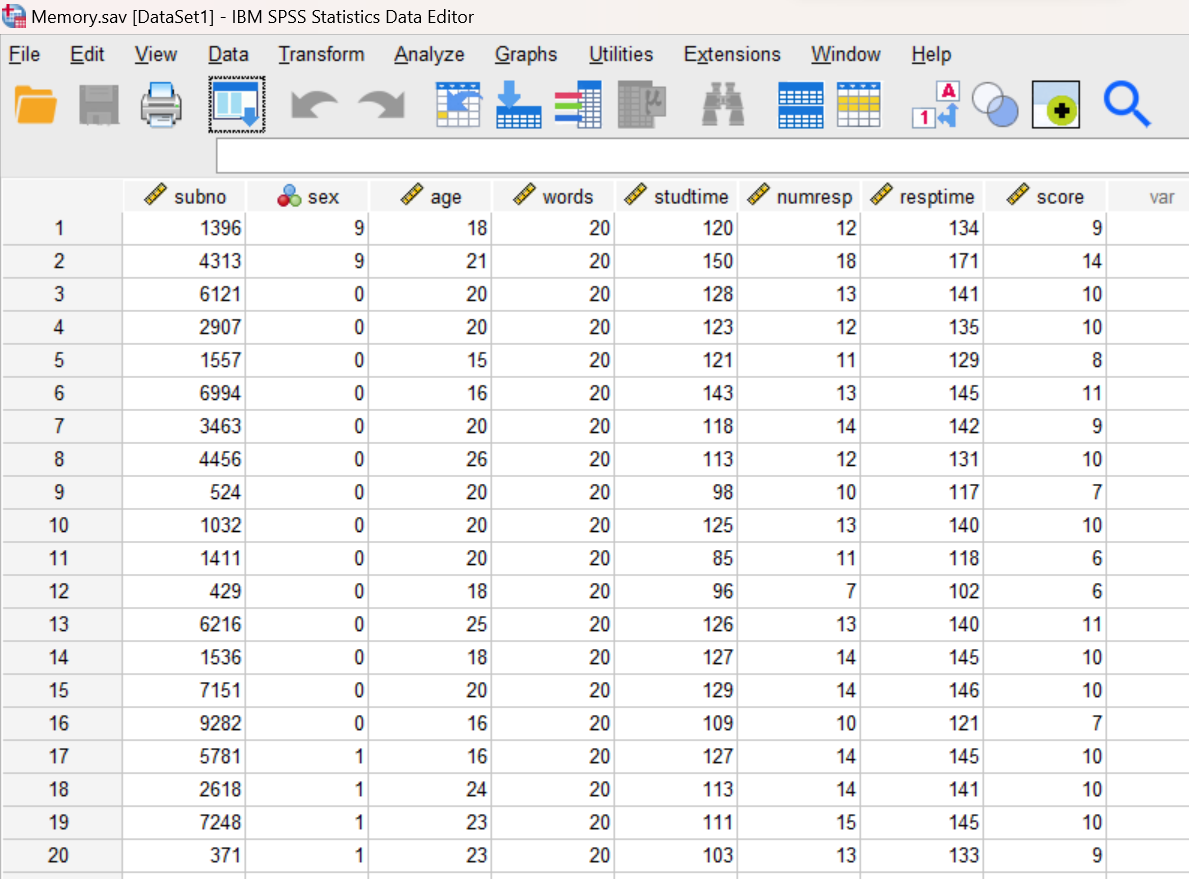
To demonstrate how to analyze data using this approach, we will be using the data file “Memory.sav”, which is available for download from the SPSS Data Files section of this book or from our course area in D2L Brightspace. This dataset is from a hypothetical study of word memorization. Participants were given a list of words on a computer screen and allowed as much time as they felt necessary to study them. They were then asked to recall as many words as they could. The file contains the following variables: subject number, sex (0=male; 1=female; 9=missing), age, number of words presented, time spent studying (in seconds), number of words responded, time spent responding (in seconds), and number of words correctly recalled.
Start SPSS and Load the Data
Start SPSS as you have done in previous labs, using your application menu or program search tool and load the “Memory.sav” data file into your Data Editor. At this point, your Data Editor window should be displaying the data:
Examine Your Variables
Examine your variables in the Data Editor, both in the Data View tab and the Variable View tab. You should notice that the age, studtime, numresp, resptime, and score variables are all defined as scale (continuous) variables. This is important because we will be computing Pearson correlation coefficients for various pairs of these variables in this lab, and the Pearson correlation requires continuous variables. We will not be using the subno, sex, or words variables in this lab.
Compute Descriptive Statistics
Before examining relationships among these variables, let’s start by computing descriptive statistics for our four variables of interest: time spent studying (studtime), time spent responding (resptime), age of participant (age), and number of words correctly recalled (score). Open a Syntax Editor window (File→New→Syntax) and type the following command.
DESCRIPTIVES VARIABLES = studtime resptime age score
/STATISTICS = MEAN STDEV MIN MAX.
Remember that the Statistics subcommand is used to specify the statistics that are to be reported. In this case, we’re asking SPSS to display the mean, standard deviation, minimum, and maximum for each variable. Run the command and review the results in your Statistics Viewer window.
Annotate Your Descriptives Output
Insert some text into your Statistics Viewer window now reporting the mean, minimum, and maximum for each of these four variables. We have been reporting standard deviations with means, and you can still do that here, but for correlation analysis it’s especially important to consider the range of the data, so minimum and maximum are probably more useful. Remember to write your comments as complete sentences.
Create a Scatterplot for Study Time and Score
Next, we will begin to examine the relationships among these variables. Before computing a correlation coefficient, it is often helpful to graph the data and examine it visually. A scatterplot is a graphical representation of the relationship between two variables. In a scatterplot, one variable is represented by each axis of the graph, and each individual is represented by a point on the graph. The pattern of the points tells us about the relationship between the variables.
If there is a noticeable trend from the lower left part of the graph to the upper right, this indicates a positive correlation (think positive slope). On the other hand, a trend from the upper left to the lower right represents a negative correlation (think negative slope). The strength of the correlation is determined by how well you can approximate the pattern of points with a straight line through the data. If all points fall on or near a straight line, the correlation is strong. If the points are more scattered and not well approximated by a straight line, the correlation is weak.
Suppose we are interested in the relationship between the amount of time spent studying (in seconds) and score on the memory test. We might expect a positive relationship here, right? More study time should result in higher scores! Let’s start by creating a scatterplot for these two variables. The GRAPH command in SPSS will produce such a chart. Return to your Syntax Editor window and type the following command:
GRAPH
/SCATTERPLOT = studtime WITH score.
The SCATTERPLOT subcommand is used to request a scatterplot. The variable before the WITH keyword will be plotted on the x-axis and the one after the WITH keyword will be plotted on the y-axis. The data can be plotted with either variable on the x-axis but typically the “predictor” variable (or the variable that “comes first”) is put on the x-axis and the variable that comes next or is predicted by the predictor is put on the y-axis.
Run the command and review the scatterplot in your Statistics Viewer window. It should look something like this: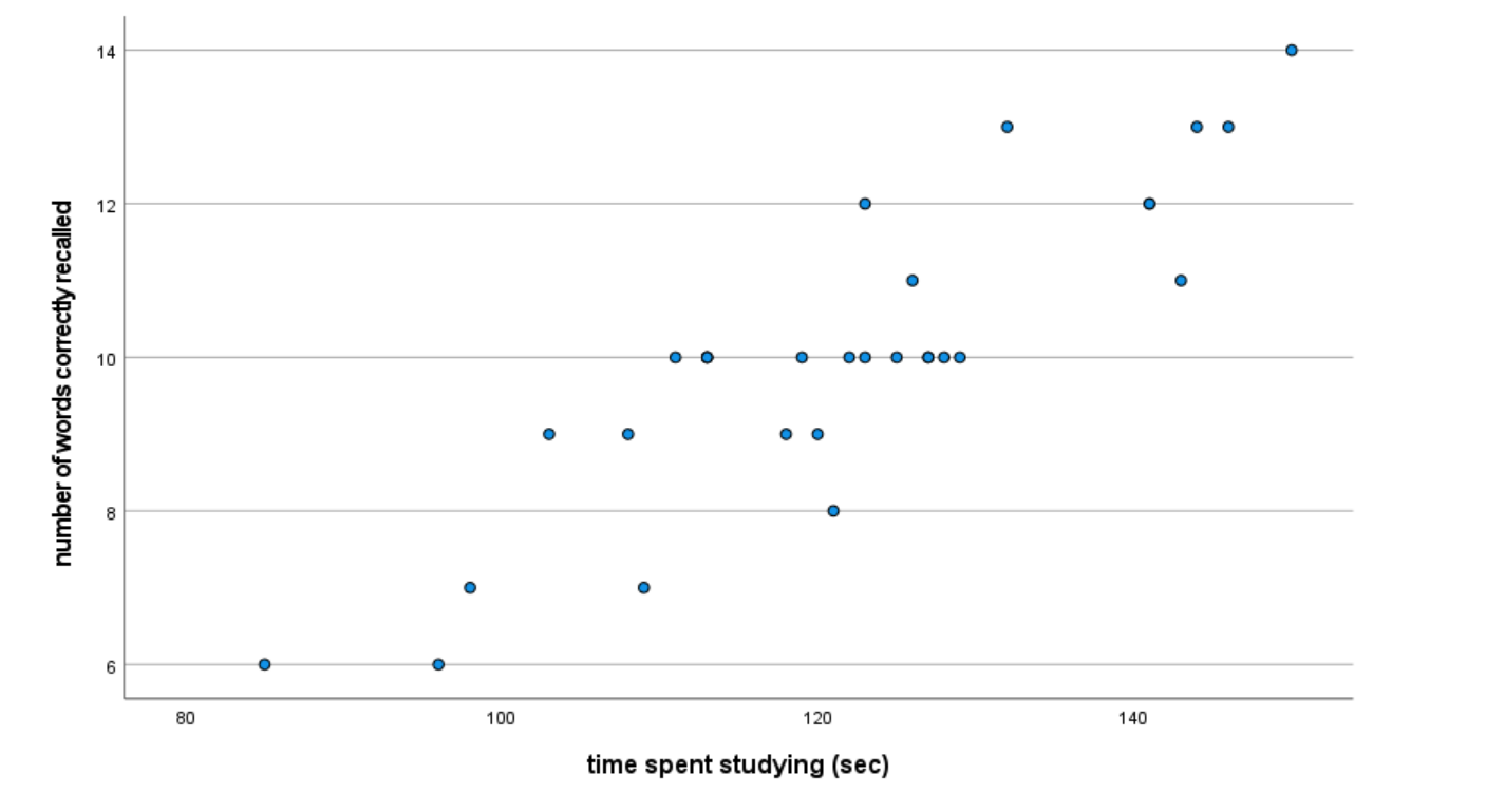
Annotate Your Scatterplot Results
What does this graph tell you? What can you say about the direction (positive or negative) and strength (weak, moderate, or strong) of the relationship, if any, between these two variables?
Add some comments into your Statistics Viewer window interpreting your graph. Be sure to include something about both the direction and strength of the relationship and what that means for the variables of time studying and memory score.
Compute a Correlation Coefficient for Study Time and Score
A Pearson correlation coefficient (coefficient is just a fancy word for a number or quantity) is the most common way to measure the relationship between two continuous variables. This correlation coefficient (Pearson’s r) gives the magnitude (strength) and direction (positive or negative) assuming a linear relationship between two variables. (If you suspect or want to measure a non-linear relationship, other statistics would be more appropriate.)
The CORRELATIONS command in SPSS is used to calculate the Pearson correlation coefficient. This command also displays the significance value from a statistical test of the null hypothesis that the correlation coefficient is equal to zero.
Return to your Syntax Editor window and enter the following command to compute and test the correlation between the amount of time spent studying (studtime) and number of words correctly recalled (score). Note that this is the same relationship we were looking at visually in the scatterplot.
CORRELATIONS VARIABLES = score studtime.
Run the command and examine the results in your Statistics Viewer window. SPSS produces a table showing the correlation coefficients for all possible pairs of the variables specified as shown below. You can ignore the duplicate entries in this table for each correlation as well as the perfect correlation (r = 1) between each variable and itself. The Pearson correlation between these two variables is highlighted below – for the given correlation, you can find the Pearson Correlation (r value), the Sig. (p value), and the N (sample size).
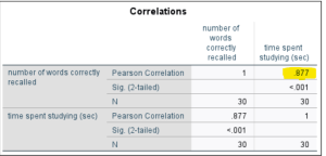
If the reported p value is less than .05 (the alpha level), you can reject the null hypothesis (remember that the null states there is no relationship between the variables) and thus conclude that the correlation is significant. If the p value is greater than .05, you will have to accept (fail to reject) the null hypothesis and conclude that the correlation is not significant. A significant correlation means there is a statistically significant relationship between the variables – as one variable changes, the other changes in a predictable way.
Annotate Your Correlation Results
Okay, time to write up your interpretation of the correlation results! This time, START by writing the one-sentence APA style result for the correlation, which should include the assessment of strength and direction as well as the r-statement (see the examples in the Lab Preview document; and make sure to check your df calculation!). That is actually all we might say in a research report because we assume readers know what that means, but you need to say more than this to show that you understand the results! So, NEXT, write a statement interpreting the results of the hypothesis test indicating your decision about the null hypothesis (i.e., will you reject or fail to reject the null?), what that decision means, and why you made that decision. FINALLY, explain how the results shown in the correlation table are consistent with the visual scatterplot you generated above, both in strength and in direction. Format your annotation as follows, including the letters A, B, and C:
- APA style sentence containing the r-statement
- Statement giving your decision about the null hypothesis, how you arrived at that decision, and what that decision means
- Explanation of how these results are shown visually in the scatterplot
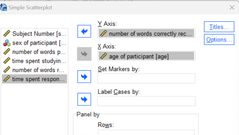
Create a Scatterplot for Age and Score
Now, try generating a scatterplot using the SPSS menu system, but this time, let’s put age of participant (age) on the x-axis and number of words correctly recalled (score) on the y-axis. The scatterplot command is available in the Graphs menu (Graphs→Scatter/Dot). Select the Simple Scatter graph type and click ‘Define’. Set up the chart as shown here to indicate which variable you want on the x-axis and which you want on the y-axis (remember, the plot shows the same relationship either way but the “predictor” variable should go on the x-axis and the “predicted” variable should go on the y-axis; here we would use age to predict memory score). Click on the OK button to generate the graph and review the result in your Statistics Viewer window.
Annotate Your Scatterplot Results
Do you see any relationship between age of participant and score on the memory test? If so, how would you describe it? Add some comments into your Statistics Viewer window interpreting the scatterplot. Be sure to include something about both the direction and strength of the relationship between these two variables.
Compute a Correlation Coefficient for Age and Score
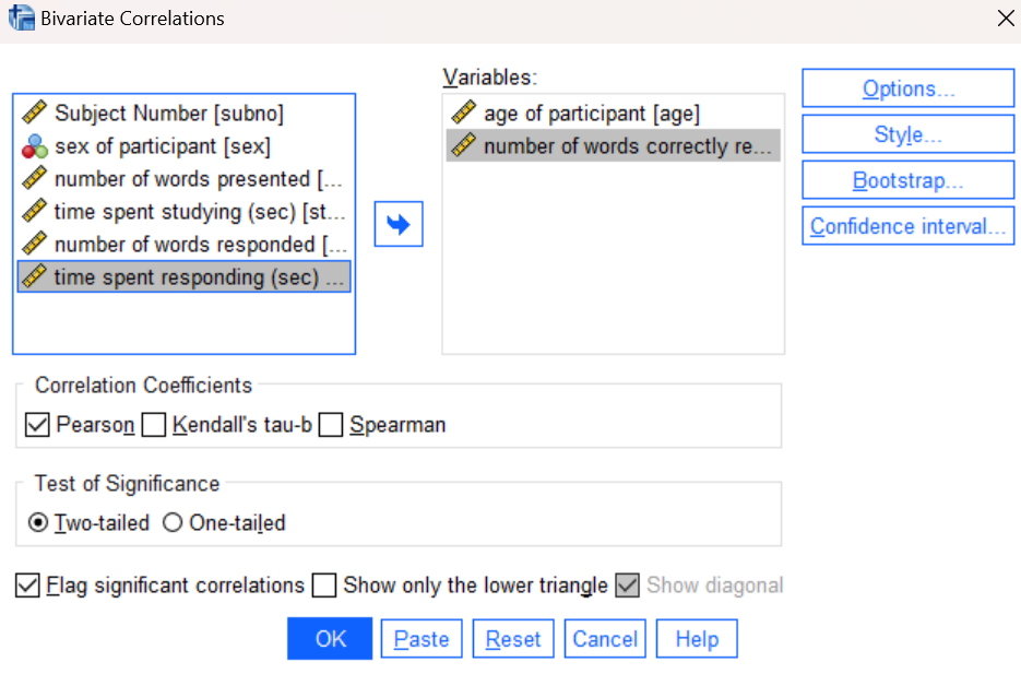
Now that we have a general idea of how these two variables (age and score) are related, let’s calculate the correlation between them, but this time using the SPSS menu system to run the command. Bivariate (two-variable) correlations are available in the Analyze menu under Correlate (Analyze→Correlate→Bivariate). Navigate to this command in the menu system and in the resulting dialog box, move your age and score variables to the Variables list as shown below. Press the OK button to run the command and examine the results in your Statistics Viewer window.
Annotate Your Correlation Results
Again, insert some comments into your output file at this point interpreting your results from this correlation analysis. Follow the same instructions and include the same three statements (including the letters A, B, and C) as for your previous correlation annotation. Start by writing the one-sentence APA style result for the correlation, which should include your assessment of strength and direction and the r-statement (see the Lab Preview document). Next, write a statement interpreting the results of the hypothesis test and whether you reject or fail to reject the null hypothesis, what that means, and why you made that decision. Finally, explain how the results shown in the correlation table are consistent with the visual scatterplot you generated above, both in strength and in direction.
Generate a Correlation Matrix for Multiple Variables
If more than two variables are specified in the Correlations command, SPSS will generate a larger correlation matrix showing correlation coefficients and hypothesis tests for all possible pairs of variables.
Note on Correlation Matrix: As you saw in the previous correlation tables, SPSS generates a lot of extra information. In particular, each correlation is actually reported twice (once for each ordering of the two variables). Furthermore, each variable is correlated with itself, producing a correlation coefficient of 1, which obviously doesn’t tell us anything meaningful! So, you’ll just have to remember to ignore the duplicate and non-meaningful correlations as you examine these tables and interpret your results.
Use either the SPSS menu system or the following command in your Syntax Editor to generate a correlation matrix for our four variables of interest.
CORRELATIONS VARIABLES = studtime resptime age score.
Your result should look similar to what is shown below:
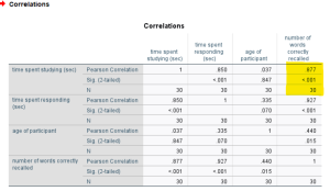
Examine the table to find the variables that are significantly correlated. Remember that we are looking at pairs of variables in correlation analysis. For each pair of variables, you will find the correlation coefficient and related p value at the intersection of the row and column for those variables. For example, the appropriate table cell to look at for the correlation between studtime and score is highlighted in the figure above (one of the correlations we calculated previously). If the p value is less than your alpha level (let’s stick with the standard .05 here), then the correlation between those two variables is statistically significant.
Annotate Your Correlation Matrix
Insert some comments at this point in your output file to interpret the results shown in the correlation matrix. Identify all the significant correlations using the p-values. Write one sentence for each significant correlation providing a clear and concise interpretation of the result, including the APA style r-statement. Do not report any non-significant correlations.
Generate a Regression Line
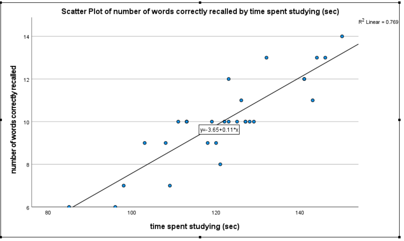
SPSS can also be used to compute the equation of the best fitting line through the data points. This is called the regression equation and the actual line is called a regression line. To add a regression line to a scatterplot, you will need to edit the graph using the Chart Editor.
In your Statistics Viewer window, go back up to your first scatterplot between studtime and score. Double-click on the graph and the Chart Editor should open. Within the Chart Editor, navigate to the Elements menu and select Fit Line at Total. Make sure that Fit Method is set to Linear in the resulting dialog box. Close the Chart Editor and your updates should now appear in the Statistics Viewer window as shown below. Notice how the regression line provides a good approximation of the data points. It should! The regression line is the best-fitting line through the data points, and the stronger the correlation is the “better” the line matches the data. It can be used to predict someone’s score who is not in the data set. For example, if we knew that someone spent 100 seconds studying the material, what would be our best guess at their memory score? We would go up from 100 on the x-axis until we hit the regression line and then go over to the y-axis to see the predicted score (about 7.5). We could also enter 100 as x into the regression equation, which includes the intercept and slope of the regression line, and then calculate the predicted y score (give it a try!). Not everyone who studied 100 seconds would get that exact score, but it would be a good guess of their possible score given the pattern of the relationship between study time and memory score.
Clean Up Your Statistical Output
Take a few minutes now to examine and clean up the contents of your Statistics Viewer window. When you are done it should include only the following outputs, plus the added annotations:
- Descriptive statistics for the four variables
- Scatterplot for studtime and score, with regression line
- Correlation table for studtime and score
- Scatterplot for age and score
- Correlation table for age and score
- Correlation matrix for all four variables
Save Your Work and Exit SPSS
Save the contents of your Syntax Editor and Statistics Viewer windows to files on your own personal drive or workspace on the network. Give them meaningful names (e.g., Lab 9) so they can be identified with this week’s lab. Use the Print to PDF function or Export to PDF to save all “visible output” to a pdf file. (No need to save your Data Editor contents since we did not make any changes to the Memory data file.) Exit SPSS by selecting the Exit option from the File menu in the active SPSS window (File→Exit).
Insert Your Name
Insert your name and Lab #9 at the top of your statistical output as an identifier. See the previous Laboratories or ask a lab assistant if you need instructions.
Submit Your Lab
Submit the PDF version of your completely annotated output file in the D2L Brightspace Assignments folder when you’re done. After uploading the file to Brightspace, open it from the assignments folder and check to make sure you have submitted the correct file and it contains all the required items for this lab.