
Lab #4 Comparing Means
Watch this RStats video for a good discussion of how to evaluate group differences in bar graphs with error bars. We will make the bar graphs in our lab a different way but the discussion of what the error bars mean and how to interpret them provides a good example for you! Note: if the video doesn’t play here, click the link to Watch on YouTube.
In this laboratory you will learn how to:
- Load an SPSS data file
- Create a new variable by recoding an existing one
- Display descriptive statistics for continuous and discrete variables
- Compute group means and confidence intervals
- Generate bar graphs with error bars
Learning Objectives
This laboratory addresses the following course objectives:
- Perform basic file operations in SPSS.
- Use SPSS to compute basic descriptive statistics.
- Use SPSS to generate charts and graphs.
- Execute SPSS commands using syntax editor and menu system.
- Interpret SPSS outputs.
Introduction
Inferential statistics often involve a comparison of means across groups or conditions in an experiment. In previous laboratories you have seen how to compute means and other descriptive statistics for continuous variables using various SPSS commands. In this lab, you will learn more about the importance of taking sampling error and variability into consideration while comparing means.
We will be using the “Driving.sav” file again in this lab. This is the same file that we worked with in the previous two labs so you should already have this file stored somewhere on your computer or network workspace. If you can’t find your copy of this file, you can download it from the SPSS Data Files section of this book or from our course area in D2L Brightspace. Once you have downloaded and/or located this file, you can continue with the lab.
Start SPSS
Start SPSS using the same procedure as in previous labs. You should be able to find SPSS from your application menu or through your program search tool. At the SPSS welcome window, just press the close button and it should take you to the Data Editor window.
Load a Data File
Use the SPSS File menu to locate and open your “Driving.sav” file (File→Open→Data). Note that you can also download and open an SPSS data file directly from D2L Brightspace by navigating to the file in our course area and then clicking on the file name.
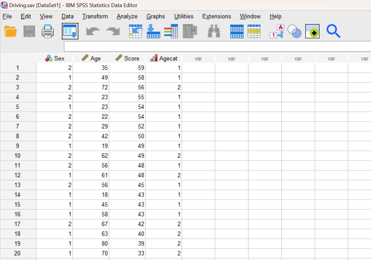
Creating a New Recoded Variable
At this point, we are going to recode the Age variable. Notice that the ages of drivers in our dataset range from a low of 18 to a high of 80. Since this is a fairly wide range, it might make sense to divide the drivers into three age categories rather than just the two (young and old) that we created with the Agecat variable in Lab #2. Let’s use the following three categories for a new variable called Agecat3: young (29 years and younger), middle (30 to 59 years), and old (60 years and older). Remember that variable names in SPSS have limitations on length and structure; we’re using the “3” here to represent that this variable has 3 categories as opposed to the original Agecat which has only 2 categories.
In Lab #2, if you recall, we created the dichotomous Agecat category variable using a manual process where you had to enter the value for every driver individually in the Data Editor. Since this can be a time-consuming and error-prone process, especially for large datasets, a better strategy is to use the RECODE command in SPSS. So that’s what we will use here.
Open a new Syntax Editor window (File→New→Syntax) and type the following commands:
RECODE Age (LOWEST thru 29 = 1) (30 thru 59 = 2) (60 thru HIGHEST = 3)
INTO Agecat3.
EXECUTE.
Notice how we are defining the three age categories and assigning them the numbers 1, 2, and 3, respectively. The keywords LOWEST and HIGHEST refer to the lowest and highest values in the dataset for the specified original variable (Age).
Also note the use of the EXECUTE command here. That’s important! The RECODE command must be followed by an EXECUTE command in order for the operation to actually take place. Why? I don’t know; but it does.
Now use your mouse to highlight and select all of those three command lines and then press the green triangle button to run them all together.
Note on RECODE command results: The RECODE command doesn’t actually produce any output, so you won’t see any results in your output window (unless you have made an error when typing in your command and then you’ll see an error message). However, you can see the results of the RECODE command in your Data Editor window (go there now to check).
After running the commands, you should notice (in your Data Editor window) that you now have an added Agecat3 variable in your dataset that identifies the three age categories that we are interested in. But we are not quite done; we still need to update the variable in the Variable View!
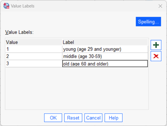
Click on the Variable View tab in your Data Editor to switch to the variable definition area. Go to the row for the Agecat3 variable. Set the decimals for this variable to 0 and add a descriptive label, maybe something like “age category, 3 groups”. Change the measurement scale to Ordinal, since this variable (like our previously created Agecat variable) places people into groups with an order but not equal intervals. Then select the cell in the Values column and click on the small square box in that cell to open the Value Labels dialog box (shown below). Select the green “+” three times to add three rows and then type in the values and labels for the categories. Press the OK button to save your work. You can just call the groups “young”, “middle” and “old” if you want; shorter but less descriptive!
Compute Descriptive Statistics for Categorical Variables
A good starting point for any analysis is to generate descriptive statistics for all the variables you will be analyzing. The appropriate statistics for categorical and continuous variables are different, as you have seen in our previous labs. In Labs #2 and #3, we already analyzed the basic frequency and descriptive statistics for our Sex, Age, and Score variables. We have a new variable now though, so we should check that.
Agecat3 is a categorical variable, so frequency distributions are the best choice for analyzing the data because they will show the number of individuals in each category. Remember that frequency tables can be requested through the FREQUENCIES command in SPSS.
Using the menu system, go to Analyze→Descriptive Statistics→Frequencies. We’ve done this analysis before in a previous lab so it should look familiar! Let’s get the frequencies for both Sex and Agecat3 – we’ve already examined Sex in a previous lab but we’ll get it again here for more practice and to show you how to analyze more than one variable at a time. Move BOTH of these variables over into the Variables box. Make sure the option for “display frequency tables” is checked because these distribution tables are what we want for categorical data. This time we won’t request any charts (but remember there is the option here to ask for a bar chart, if we wanted that) or other statistics (but there are options to get other stats, if we wanted them). Click OK to run the analysis.
Review the results of the FREQUENCIES command in your Statistics Viewer window. The output will look like what we have seen in previous labs when using this command except that you should see the analysis for both of the variables we selected for (Sex and Agecat3).
Annotate Your Frequencies Output
Add a sentence or two at the bottom of your output file to briefly summarize what you have learned from this analysis. In this case, you will want to report out the number and percentage of male and female drivers as well as the number and percentage of drivers in each of our three age categories. Work to be concise as per APA style! APA style often reports percentages in the sentence and Ns in parentheses, as in something like “The sample was xx% male (n = xx) and xx% female (n = xx).”
Descriptive Statistics for Continuous Variables Separately by Groups
For continuous variables, like driving score, there are several different SPSS commands we could use to generate overall descriptive statistics (e.g., Frequencies, Descriptives, and Explore commands). For the purposes of this lab, though, we are going to use a new MEANS command and then the EXAMINE/EXPLORE command that we used in a previous lab because these commands can give us descriptive statistics broken down by categories of a different variable, which is what we want to do here.
In our previous labs, we have found the mean and standard deviation for the driving score variable. If you don’t remember, the average driving score was 48.00 (SD = 6.95). Our question now, though, is whether that driving score differs for people with different demographic characteristics. We examined differences in driving score for young vs. old drivers in a previous lab, but now we have our three groups for age instead of just the two. We can also examine the differences in scores for males vs. females. And, we want to make these group comparisons while also considering information about confidence intervals so we can make better sense of the mean differences.
Comparing Group Means with the Means Command
In a previous lab, you learned how to use the EXAMINE command (or Explore through the menu system) to break a continuous variable down by categories and generate descriptive statistics within each category. We’ll do that again below. However, the MEANS command in SPSS can also be used for this purpose, and it provides output that is a bit more concise and readable.
Suppose we are interested in comparing driver’s exam scores for males and females. Is there any difference in how those two groups scored on the driving exam?
Open a new Syntax Editor window and use the MEANS command to generate a table of means and standard deviations for the driving Score variable broken down by Sex:
MEANS TABLES = Score BY Sex
/CELLS MEAN STDDEV COUNT.
The TABLES part of the command is used to specify how a continuous scale variable (Score) is to be broken down by a categorical variable (Sex). In this case we will get one row in the table showing statistics for each of the two categories of the Sex variable (male and female), as well as the same statistics for the entire sample.
The CELLS subcommand specifies which statistics are to be generated for the continuous scale variable (Score) within each category. In this case, we have requested that SPSS compute the mean (MEAN), standard deviation (STDDEV), and the number of scores (COUNT).
You can also run the MEANS command through the menu system, and in fact you will probably find that it’s much easier to run it that way! Go to Analyze→Compare Means and Proportions→Means and see if you can run the same analysis through the menu system that you just performed using the Syntax Editor. After comparing your results, remove the duplicate outputs from your Statistics Viewer window before proceeding.
Annotate Your Means Table Output
Review the results of the MEANS command in your Statistics Viewer window. Does there seem to be a difference in the average driving scores for males and females? Insert some text into your output file at this point to provide your interpretation of these results. Work on using APA Style from previous labs’ instructions to report the means, standard deviations, and sample sizes for each of the two groups, as well as your deduction on whether the groups appear to be different.
Graphing the Group Means with Error Bars via Syntax
When making these kinds of group comparisons, it is often helpful to generate a visual representation of the group or condition means that includes the “margin of error” so that we can assess whether there is a real difference between groups or if the difference is just due to chance. A good way to do this is to compute the 95% confidence intervals (CIs) around the means and evaluate whether those intervals overlap.
There’s more info about confidence intervals below, but the basic idea is that CIs show the possible range of values for a given statistic (like the mean). We have a small sample of people and are using that to estimate scores in the population, but we need to consider that data from a sample always includes sampling error. A different sample of people will have a different mean (and standard deviation, etc.). The confidence interval is symmetrical around the sample value and provides a range of likely values that the population parameter actually falls in, taking sampling error into account.
Okay, so back to our comparison of driving scores by gender; let’s create a graph that includes the confidence intervals around the mean. In SPSS, we can generate numerous types of charts and graphs using the GRAPH command. Among the most useful kinds of visuals for comparison of means is the Bar Chart with added error bars.
Return to your Syntax Editor window and use the GRAPH command to generate a bar chart of the mean exam scores for males and females:
GRAPH BAR = MEAN(Score) BY Sex
/INTERVAL CI(95.0).
The MEAN keyword indicates that the mean of the dependent variable (Score) should be graphed for each category of the second variable (Sex, in this case). Other possible keywords include MEDIAN, MODE, MAXIMUM, MINIMUM, STDDEV, and VARIANCE, but examining MEANS is most common.
The /INTERVAL subcommand tells SPSS to add error bars to the graph, of the type noted (CI).
Note on error bars: SPSS provides options for other kinds of error bars that researchers may be interested in (such as standard errors and standard deviations), but for the purposes of this class, we will stick with 95% confidence intervals, at least for now.
Examine the output in your Statistics Viewer window. Do you see a difference in the means for the two groups? You should notice that the height of each bar corresponds to the mean. But remember that we should also be including the confidence intervals (the margin of error) when making this kind of group comparison. Do the confidence interval (CI) error bars help in deciding whether there is a true difference between the means for the two groups? Just as above with the actual CI numerical values from the Descriptives table, you should be looking to see whether the range of scores represented by the two CIs overlap (see example of overlapping vs. non-overlapping error bars below). You should notice that for our data, the CIs do overlap quite a bit (although they don’t fully capture the other group’s mean within the interval); this tells us that there is likely not a true difference between the group means even though it looks like females might have higher driving scores when we just compare the two sample mean values.
Example of Overlapping vs. Non-overlapping Error Bars
Here’s an illustration of what we mean by overlapping vs. non-overlapping error bars and how to interpret them. In this case, they are using standard deviation error bars, but the concept is the same when using CI error bars.
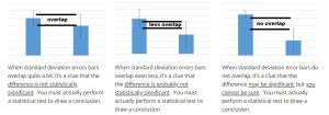
from https://www.biologyforlife.com/interpreting-error-bars.html
Annotate Your Graph Output
Insert a sentence or two at the bottom of your output file interpreting the graph you have just generated. What can you conclude about the performance of male and female drivers? (If your conclusion here differs from your conclusion in the previous annotation, that’s okay; you have more information now that you didn’t have before to be able to better evaluate the difference between males and females.)
Comparing Group Means with Examine/Explore and Confidence Intervals
What if we want to find the exact values of the confidence intervals, rather than just seeing them on a graph, you ask? Well, SPSS can do that too! The EXAMINE/EXPLORE command (EXAMINE via syntax, EXPLORE with the menus) provides the 95% CI around the mean as part of the generated output.
The EXAMINE/EXPLORE command can also provide descriptive statistics separately for groups of a categorical variable, as we saw in a previous lab.
Let’s use the menu system to generate our commands this time. You will probably find that it’s quite a bit easier to generate your output and graphs through the menus because you don’t have to remember all the detailed command syntax (and punctuation)! In particular, we’re going to generate descriptive data with CIs and a bar chart but this time we’ll do so looking at driving score for old, middle, and young drivers (the Agecat3 variable) rather than for males and females.
Go to Analyze→Descriptives→Explore. Move Score over to the dependent list; it’s the variable for which we want the mean. Then, add Agecat3 as the “factor” (make sure to use the age variable with 3 categories and not the age on a scale or the age with two categories!); remember the “factor” is the “by” variable, a categorical variable that we will split the data by. Click the radio button at the bottom to show only the “Statistics” and not plots. Graphs are nice to look at sometimes but other times it’s just a lot of output that we don’t need; we saw what the EXPLORE/EXAMINE graphs looked like in a previous lab.
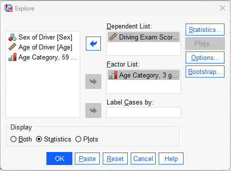
Press the OK button to run the command and review the results in your Statistics Viewer window.
Interpreting Confidence Intervals
As noted above, using confidence intervals around the mean is one way to examine sampling error. For a given sample, we recognize that it will differ somewhat from the larger population from which the sample was taken. Thus, we can examine confidence intervals as one way of better estimating the population mean from the sample mean. The “95%” part of the confidence interval has to do with area under the normal curve and how “confident” we are that we have captured the actual population mean in the interval (with 95%, we are pretty darn confident!). You can ask for different levels of “confidence” (e.g., the 90% confidence interval, the 80% confidence interval), but 95% is the standard as it relates to the logic of p < .05 that we will learn about later in the semester. How wide the CI is depends on sample size and variability of scores (larger sample sizes and smaller variability of scores in the sample leads to smaller CI width, or less sampling error).
Review the results of the EXPLORE command output in your Statistics Viewer window. Note that the confidence interval information that we now want is at the top of the information for each section, as indicated here for the young drivers:
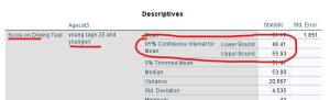
Find the 95% CIs for the mean for the young, middle, and old groups. Notice how the CI is symmetrical around the mean; this is always true and is a function of how CIs are calculated. The statistics are saying, essentially, the mean of this sample is xx but a good estimate of the true population mean is between xx and xx (lower and upper bound of the CI). The confidence interval gives you a range of possibilities for the true population mean for each group.
Graphing the Group Means with Error Bars via Menus
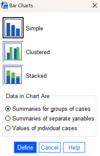
Next, let’s create a bar chart showing how our three age categories compare. A bar chart can be requested using the SPSS Graphs menu (Graphs→Bar). Navigate to this command and you should see a window pop up giving you various options for how the chart should be set up as shown here on the right:
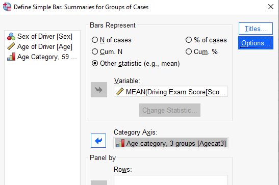
For now, just click on the Define button and accept the default options for “Simple” and “Summaries for groups of cases”. Those options will work for most of the graphs we will be creating in this class. In the resulting dialog box, click on the “Other statistic” button in the top section. Then move your Score variable to the Variable box and your Agecat3 variable to the Category Axis box as shown below:
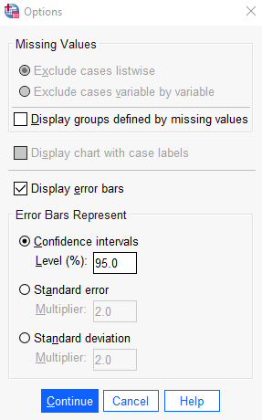
MEAN is the default statistic, which is what we want to plot. Click on the Options button and check the Display error bars box, Then, select the option to display Confidence intervals (with the standard 95% level) as shown here:
Press the Continue button in the Options box and then the OK button in the original dialog box to run the command and generate your bar chart. Review the results in your Statistics Viewer window.
Annotate Your Explore and Graph Output
Insert some comments into your output file interpreting the results of the commands you have just run (the descriptives table and bar chart). The statistics and bar chart both show the mean and 95% confidence intervals, just in different ways. What can you conclude about the driving performance of the three age groups? Remember to take the margin of error (confidence interval) into account as you make your comparisons! Think about how to write things out in concise APA style, reporting the mean and 95% CI for each group, along with a statement about whether the age groups seem to be different/higher/lower/the same when compared to each other. (One hint for APA style would be to report the 95% CIs similarly to reporting the SDs – in parentheses after the mean; the upper and lower limits create the interval, which would be reported as “95% CI = xxx – xxx”.) With three groups, remember that you have multiple comparisons to make, including young vs middle, young vs old, and middle vs old! As you analyze these results, you should be noticing that there is overlap in the confidence intervals for all three age groups. What does this tell you about the true mean differences in driving score between these age groups in the population?
Insert Your Name
If you have not already done so by now, insert your name and Lab #4 at the top of your statistical output as an identifier. See the previous laboratories or ask a lab assistant if you need instructions for how to do this.
Clean up Your Statistical Output
Take a few minutes now to examine and clean up the contents of your Statistics Viewer window. When you’re done it should include only the following items as well as your annotations:
- Frequencies command output for the Sex and Agecat3 variables
- Means command output for Score by Sex
- Bar chart for Score by Sex
- Explore command output for Score by Agecat3
- Bar chart for Score by Agecat3
Save Your Work and Exit SPSS
Save the contents of your Data Editor, Syntax Editor, and Statistics Viewer windows to files on your own personal drive or workspace on the network. Give them meaningful names (e.g., Lab 4) so that they can be identified with this week’s lab. Use the Print to PDF function or the Export visible output to PDF to save a PDF version of your output file as you have done in previous labs. You can then exit SPSS by selecting the Exit option from the File menu in the active SPSS window (File→Exit).
Submit Your Lab
Submit the PDF version of your completely annotated output file in the D2L Brightspace Assignments folder when you are done. After uploading the file to Brightspace, open it from the assignments folder and check to make sure you have submitted the correct file.