
Lab #2 Variables & Frequency Distributions
Watch this video from the RStats Institute for a good introduction to working with frequency distributions in SPSS. Note that the presenter is using the Mac version of SPSS, so the screens will look slightly different if you are using SPSS for Windows. Note: if the video doesn’t play here, click the link to Watch on YouTube.
In this laboratory you will learn how to:
- Define and enter data
- Add a new variable to a data set
- Generate frequency distributions for your variables
- Create charts and graphs of data
Learning Objectives
This laboratory addresses the following course objectives:
- Perform basic file operations in SPSS.
- Enter data into SPSS.
- Use SPSS to generate charts and graphs.
- Execute SPSS commands using Syntax Editor and menu system.
- Interpret SPSS outputs.
Introduction
This laboratory provides an opportunity for additional practice in defining variables and entering data in the SPSS Data Editor. You will also learn how to use SPSS commands to display your data in frequency distribution tables and various types of graphs.
Start SPSS
Start SPSS using the instructions from the previous lab. You may see a Welcome window that gives options for opening files or viewing tutorials. Just press the close button to close that window and you will then see a spreadsheet-type window called the Data Editor, which should look something like this:

Naming and Defining Variables
Suppose we want to analyze a dataset consisting of scores for 20 drivers on a behind-the-wheel driver’s exam (out of 60 points possible) collected by the Bureau of Motor Vehicles. The dataset consists of the variables of sex, age, and driving score. The first thing we need to do is set up our variables for data entry!
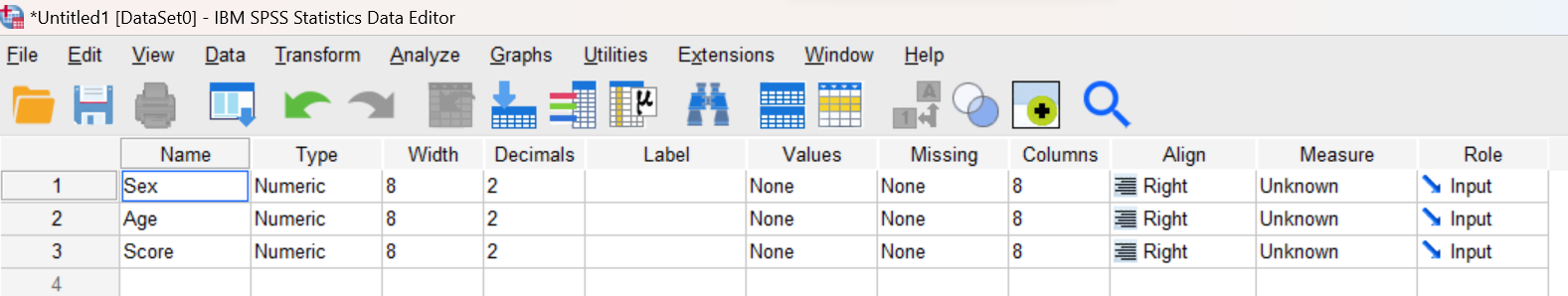
Click on the “Variable View” tab at the bottom of your Data Editor window. This brings you to a spreadsheet-like interface where you can view and define all your variables. In this spreadsheet, variables will be listed in rows, with columns representing the variable attributes. For this dataset, we will need to define three variables: Sex, Age, and Score.
Step 1: Enter the name for each of the three variables in the Name column, each variable in a separate row as shown here:
Step 2: In the Type column, code each of your three variables as Numeric, indicating that all of our data will be entered as numbers (we will be using the numbers 1 and 2 for Male and Female, respectively).
Step 3: Our data do not contain any decimal places, so set the number of decimals to 0 for all three variables in the Decimals column.
Step 4: Use the Label column to provide a descriptive label for the Score variable. This is the text that SPSS will display for the variable in the output file. So, for example, you could enter the text “driving test score” or “score on driving test” or other wording of your choice to indicate the type of score that you will be analyzing. You can enter similar labels for the other two variables.
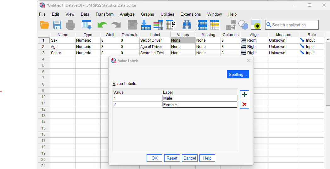
Step 5: Use the Values column to provide value labels for the categories within the Sex variable (click on the “None” text in the Values column, then click the small blue button that appears). We will use a value of 1 for Male and a value of 2 for Female, so use the resulting dialog box to assign the label “Male” for value 1 and “Female” for value 2 as shown below. After entering both value/label assignments, press the OK button to save your work.
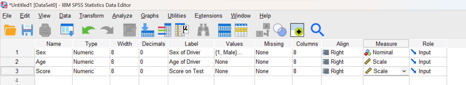
Step 6: Specify the scale of measurement as Nominal (Categorical) for the Sex variable (click on the “Unknown” text in the Measure column, then select “Nominal”). Similarly, set the scale of measurement to “Scale” (which is used for Interval or Ratio data) for both Age and Score. All other columns can be left as is.
At this point, your Data Editor window should look similar to the following:
Enter Your Data
Now that your three variables are defined, let’s enter the data!
- Click on the “Data View” tab at the bottom of the Data Editor window to return to the spreadsheet for data entry. Notice that the three variables you have defined now appear as column headers.
- Enter the numeric values for each variable as given in the data table. Be sure to enter 1 for Males and 2 for Females in the Sex column, rather than ‘M’ and ‘F’!
|
Sex |
Age |
Score |
|
M |
70 |
33 |
|
F |
56 |
48 |
|
F |
62 |
49 |
|
M |
18 |
43 |
|
F |
67 |
42 |
|
M |
45 |
43 |
|
M |
80 |
39 |
|
M |
61 |
48 |
|
F |
56 |
45 |
|
F |
35 |
59 |
|
M |
23 |
54 |
|
F |
29 |
52 |
|
M |
19 |
49 |
|
F |
23 |
55 |
|
F |
72 |
56 |
|
M |
63 |
40 |
|
M |
58 |
43 |
|
F |
22 |
54 |
|
M |
49 |
58 |
|
F |
42 |
50 |
Add a Re-Coded Variable
At this point, we’re going to add another variable to the dataset. The purpose of this variable will be to divide the drivers into two groups, old drivers and young drivers. Follow these instructions:
Step 1: Navigate to your Data Editor window and click on the Variable View tab to bring up the spreadsheet for defining variables. You should see three rows representing the variables currently in your data set: Sex, Age, and Score.
Step 2: Add a new (fourth) variable for dividing the individuals into two groups: old drivers (60 years or greater) and young drivers (59 years or less). Let’s call this variable Agecat, which is short for “Age category”.
Reminder on variables names: In SPSS, variables must be a single word with no spaces. So something like “Agecat” would be allowed, but “Age Category” would not. Because of this limitation on variable names, it is good practice to add a variable label, as you learned earlier, to give a lengthier description for each variable in your dataset.
Step 3: Code your new variable as Numeric, with zero decimal places, and specify the measurement scale as Ordinal (because the Agecat variable we are creating is a categorical variable with ordered categories).
Step 4: Provide a variable label for this new variable (click on entry in Label column then type in some text). In this case, something like “Age Category, age 59 and younger vs age 60 and older” would be good.
Step 5: Decide what numbers you want to use for the two category labels and enter the value labels accordingly as we did for the Sex variable earlier (remember: click on the cell in Values column then click on the blue button that appears). Something like 1 for “Young” or “age 59 or less” and 2 for “Old” or “age 60 or older” would work; you can use different numbers and category names if you want.
Step 6: Click on the Data View tab to switch back to the data entry area and manually enter the appropriate numeric value of the Agecat variable into the spreadsheet for each driver, based on how you defined your value labels (i.e., enter a 1 for drivers with ages 59 or lower and 2 for drivers with ages 60 or higher).
Check Your Work (and put your data in the output window for assignment purposes)
At this point, let’s start running some commands with our data. Open up a new Syntax Editor window (File→New→Syntax). Type the following command and then press the green triangle icon at the top of the window to run the command.
LIST.
After executing the command, a new Statistics Viewer window should open showing the results of this command. Examine the List command output and verify that the age category has been entered correctly for all 20 drivers. Your output should look something like this:
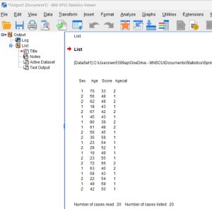
If you discover any mistakes, go back to your Data Editor to make the appropriate changes, and then run the List command again from the Syntax Editor. (Remember to delete any duplicated or unwanted outputs in your Statistics Viewer window before moving on.)
Just by browsing through the data, can you tell which group (old drivers or young drivers) performed better on the driver’s exam? Don’t worry, we’ll learn some commands that will make this kind of comparison a little easier in the next lab!
Frequency Distributions in SPSS: Bar chart for nominal variable
Now that we have our data, as a starting point for any statistical analysis, it is always a good idea to examine the distribution of the data for each of your variables. This will not only give you a feel for what the data look like, but also will help you identify outliers (extreme values), miscoded, and missing data, allowing corrections to be made before further analyses are performed. In SPSS, the Frequencies command can be used to generate frequency distribution tables and graphs. Like most SPSS commands, this command can either be typed into the Syntax Editor window or selected from the SPSS menu system.
Let’s start by learning how to execute this command using the Syntax Editor. Navigate back to your previously opened Syntax Editor window, move your cursor to a new line, and type the following command:
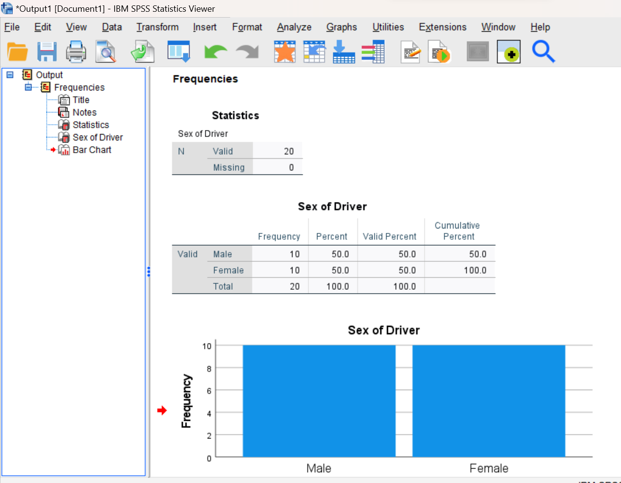
FREQUENCIES VARIABLES = sex
/BARCHART.
Feel free to use lower case for command words and variable names but remember that SPSS is very picky about spelling and punctuation so pay careful attention to those details (and don’t forget about the period at the end of the command). Note that the “/BARCHART” part of this command is a subcommand telling SPSS to generate a bar chart for the selected variable. Subcommands such as this are normally typed on a separate line for clarity.
Run this command by pressing the right-pointing green triangle button at the top of your Syntax Editor window. Remember that your cursor needs to be positioned on one of the command lines so SPSS knows which command you would like to run.
The output from this command will be displayed in your Statistics Viewer window. You should see a frequency distribution table and bar chart as shown here:
Annotating Your Frequencies Output
As you learned in the previous lab, a nice feature of SPSS is that it allows you to insert comments into your statistical analyses to further explain what’s being displayed. Let’s add a couple of comments now about the output you just produced. Here’s the procedure to follow:
Step 1. Be sure nothing is currently highlighted in the Statistics Viewer window before proceeding or your text will not be inserted properly.
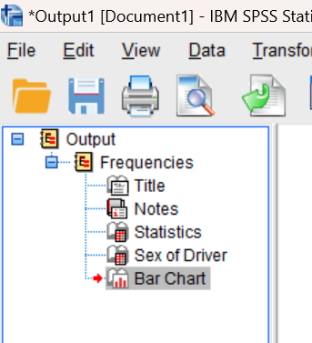
Step 2. Click on the last icon in the left-hand pane of the Statistics Viewer window to move your current position to the bottom of the file. You will see a small red arrow indicating your current position, as shown here:
Step 3. Now select “New Text” from the Insert menu (Insert→New Text). This should open a new text box in your output file. Type a sentence in this box stating the total number of drivers as well as the number of drivers in each category, as you can see from the output you just generated.
Step 4: When you are finished typing in the new text, click somewhere outside of the text box to make sure that the text box is de-selected and your comments are saved. Your resulting annotation should look similar to the following (with the actual numbers inserted where the x’s are!):

Frequency Distributions in SPSS: Histogram for continuous/score variable
Next let’s generate a frequency distribution for the driving score variable. The command will look a bit different for continuous variables such as this. One change is that instead of a bar chart, we will be requesting a histogram, because a histogram is an appropriate type of graph for continuous data. Also, for continuous variables, we normally don’t care about seeing the number of people with each distinct value (the list of possible scores is usually long and cumbersome). We can turn the frequency table option off by using the NOTABLE option (for “no table”) on the FORMAT subcommand.
Note on frequency distribution graphs: While a frequency table can be very useful for examining your data, it is often easier to understand the distribution of a variable when it’s displayed in a graphical format. Bar graphs and pie charts are commonly used to show frequencies for nominal and ordinal (categorical) data, whereas histograms are commonly used to show frequencies for interval and ratio (continuous) data.
Navigate back to your previously opened Syntax Editor window and enter the following command starting on a new line after your previous Frequencies command:
FREQUENCIES VARIABLES = score
/FORMAT = NOTABLE
/HISTOGRAM.
Make sure your cursor is on one of the command lines and click on the green triangle icon at the top of your Syntax Editor window to run the command.
Annotate Your Frequencies Output
You’ll see the new output added to your Statistics Viewer window. Again, let’s add a couple of comments now to describe the output you just produced. Follow the same procedure as above to insert some text below the output, this time describing the range of the data (lowest score and highest score), and the location of any peaks in the histogram. Remember that the peaks in a histogram indicate scores with the highest frequencies.
Using the Menu System to Display Frequency Distributions: Histogram for a continuous/score variable
Now, let’s practice using the SPSS menus and dialog boxes to execute the Frequencies command for the Age and Agecat variables.
Step 1: To run frequency distribution commands via the menu system, click the Analyze menu at the top of your current SPSS window, then select Descriptive Statistics and then Frequencies (Analyze→Descriptive Statistics→Frequencies). The Frequencies box, like below, should pop up:
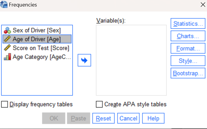
Step 2: Select your variable of interest (in this case, Age) and press the right arrow icon to move it to the Variables box. Un-check the “Display frequency tables” box (since this is a continuous variable and we don’t need to see a frequency table of all the scores).
Step 3: Next, click on the Charts button on the right side of the window. A Chart selection window will appear, allowing you to select a Bar Chart, Pie Chart, or Histogram. In this case, since Age is a continuous variable, you should select the histogram (you can select the option to include the normal curve if you want but it’s not necessary).
Step 4: Click on the OK button at the bottom of the dialog box to execute the command and your output should then appear in the Statistics Viewer window. Your screen should now look similar to the following:

Bonus Tip: If you ever make a histogram and do not like how SPSS has automatically grouped the scores on the x-axis into bins, you can change that! Double-click on the chart and an editor window opens up where you can modify settings of the graph. Changing the interval width in the binning options will change the width of the histogram bars. You don’t need to do that here, although you can try it if you want to!
Annotating Your Frequencies Output
Follow the same procedure as described above to add a couple of comments into your output file about the histogram you just generated. Describe the range of the data (e.g., lowest age and highest age) and the location of any peaks in the histogram (the modes, using statistical terminology).
Using the Menu System to Display Frequency Distributions: Pie chart for ordinal variable
Now we will repeat this same general procedure, but this time for the Agecat variable.
Step 1: Navigate back to the Frequencies dialog box (Analyze→Descriptive Statistics→Frequencies)
Step 2: Replace the Age variable with the Agecat variable in the Variables box (move the Age variable out and the Agecat variable into the variable list). Since Agecat is a categorical variable where seeing a list of all possible categories and their frequencies is helpful, check the “Display frequency tables” option this time.
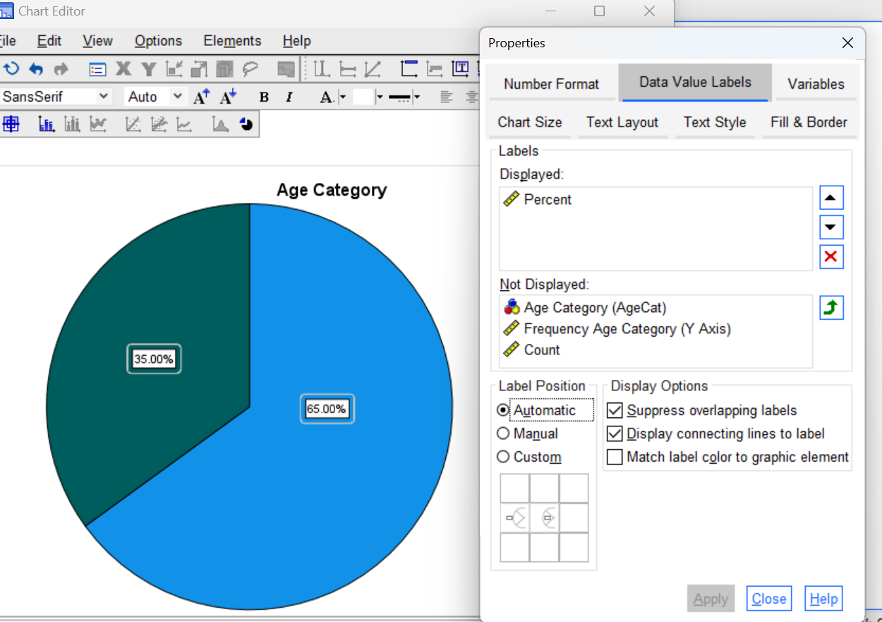
Step 3: Click on the Charts button on the right side of the window and this time select the pie chart and choose percentages as your chart values.
Step 4: Click on the OK button at the bottom of the Frequencies dialog box to execute the command and your output should then appear in the Statistics Viewer window.
Step 5: Note that pie charts are a bit more informative if they include the percentage on each slice, so let’s edit the pie chart to add percentages:
-
- Start by double clicking on your pie chart in the Statistics Viewer window. This will bring up a new Chart Editor window, which allows you to make changes to the formatting of your chart.
-
- In the Chart Editor Window, go to the Elements menu and select Show Data Labels (Elements→Show Data Labels). If the properties menu pops up, make sure to move the percent option into the Labels Displayed box using the green up arrow (as shown below) and take any other options out by hitting the red X.
-
- Next, go to the Number Format tab in the Properties window of the Chart Editor and change the decimals to 0 to show the percentages in whole numbers (see below).
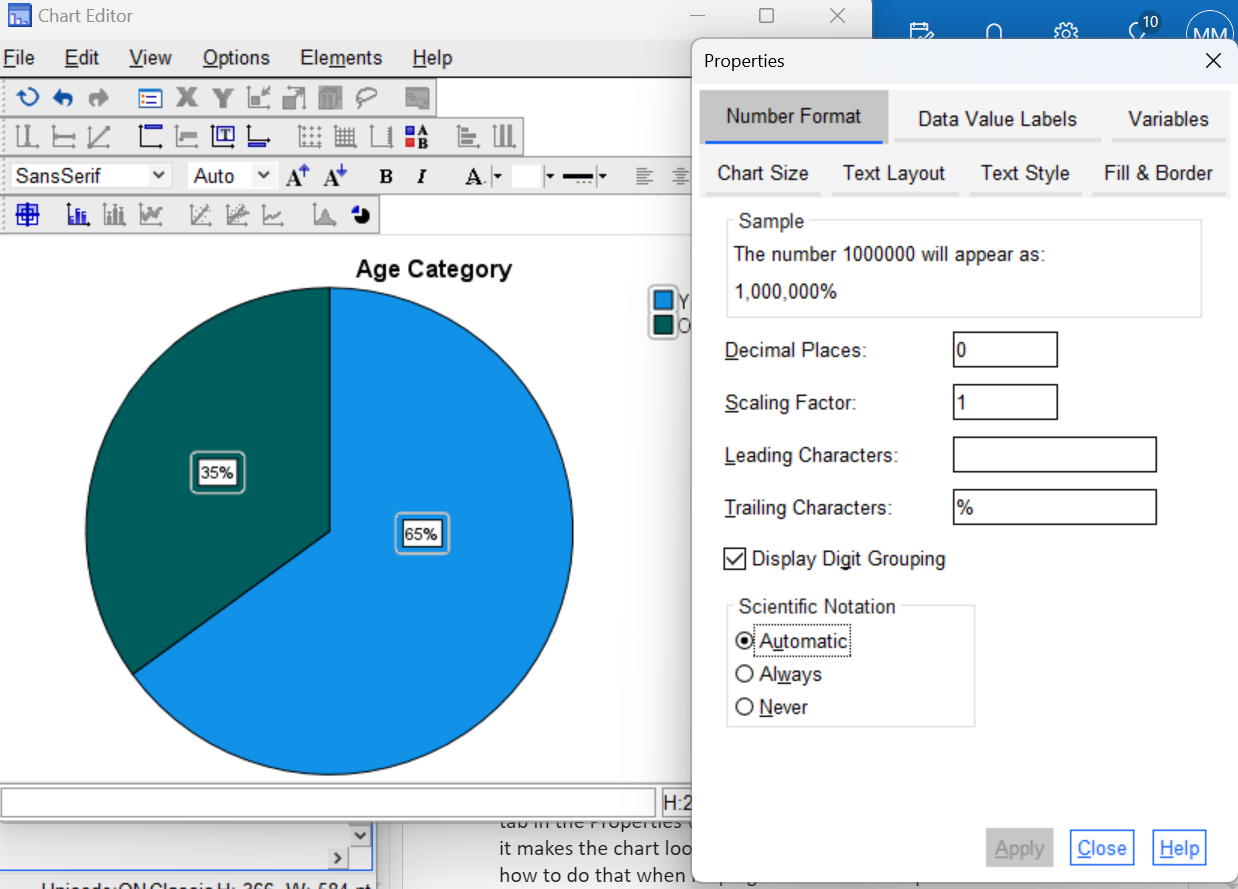
-
- Close out of the Chart Editor window and the percentages should now appear on the pie chart in your Statistics Viewer.
Annotate Your Frequencies Output
Again, insert some text at this point into the Statistics Viewer window to describe the outputs you just produced in the frequency distribution chart and pie chart. For example, it would be good to comment on the percentage of drivers in each of the two age categories.
Clean Up Your Statistical Output
As you execute SPSS commands either through the Syntax Editor or using the SPSS menus, results of these commands will appear as outputs in your Statistics Viewer (output) window. It is very easy to accumulate a lot of meaningless or duplicate information in this window, and thus it is good practice to keep your output clean by removing unwanted items as you go.
Note on warning and error messages: If you enter a command incorrectly in SPSS, you are likely to get a warning or error message (which may or may not be helpful in telling you what you did wrong). You will need to check your command syntax or how you have thing set up in the menu system. Once you have corrected your error and the command runs successfully, be sure to remove the warning or error message from your output window as well as any other outputs generated by the incorrect command.
Fortunately, it is easy to selectively delete sections of this output that you don’t want. If you open your Statistics Viewer window and examine the layout you will see that the left pane of this window contains an outline of the contents in the right pane. If you select an item in the outline (left pane) with your mouse and then press the Delete button on your keyboard, the corresponding section of your output in the right pane will be removed. You can also select and delete individual items directly from the right pane.
Take a few minutes now to examine and clean up the contents of your Statistics Viewer window. When you’re done, it should include only the following items as well as your annotations (you should have an annotation after each graph):
- List command output after you entered the Agecat data
- Frequency distribution table and bar chart for the Sex variable
- Histogram for the Score variable
- Histogram for the Age variable
- Frequency distribution table and pie chart for the Agecat variable
Insert Your Name in the Statistical Output
At this time, if you have not already done so, you should insert your name and Lab #2 into the statistical output as an identifier at the very top of your file, just as you did for the previous lab:
- Click on the top icon in the left-hand panel of the Statistics Viewer window to move your current position (red arrow) to the top of the file.
- Select New Text from the Insert menu (Insert→New Text) and type your name and Lab #2 in the resulting text box. Feel free to change font style, size, etc. as you wish.
- Use your mouse to click outside of the text box so that the text box is de-selected and your text is saved.

Save Your Work and Exit SPSS
Before exiting SPSS, it is a good idea to save your work! As mentioned in the previous lab, it is recommended that you use the Save as (File→Save as) command to save the contents of each of your three windows to a separate file on your computer, USB drive, or network workspace. Be sure to save the files to a location where you will be able to find them after exiting SPSS.
- Go to the Data Editor and use the “Save as” command to save your driver exam data. At the prompt for file name, enter “Driving”. This will save all variable definitions and data values to an SPSS data file with file name “Driving” and “.sav” extension.
- Similarly, you should save the contents of your Syntax Editor window. Give it a meaningful name (e.g., Lab 2) so that it can be identified with this week’s lab.
- Finally, save the contents of your Statistics Viewer window so that you can submit it to your lab instructor for grading. Again, give it a meaningful name (Lab 2) so it can be identified with this week’s lab.
- Use the Print to PDF function (Windows computer) or the Export function (for a Mac computer) to save a PDF version of the Statistics Viewer output file as you did in the previous lab. Make sure to save/print “all visible” output and to open your pdf file once it’s created to double-check that is has all the output and annotations you have created!
You can now exit SPSS by selecting the Exit option from the File menu in the active SPSS window (File→Exit).
Submit Your Lab
Remember to submit the PDF version of your completely annotated output file for this lab in the D2L Brightspace Assignments folder when you are done. After uploading the file to Brightspace, open it from the assignments folder and make sure you have submitted the correct file and that it has all of the output in it that you need!