
9 Statistics With Werewolves
A Little More Logical | Brendan Shea, PhD
Statistics is the science of data. It involves the processes of collecting, analyzing, interpreting, and presenting numerical information. This field helps us make informed decisions based on data, allowing us to extract meaningful patterns and conclusions from a sea of numbers. By using statistics, we can transform raw data into useful insights, providing the ability to forecast trends, test hypotheses, and understand the world in a more data-driven way.
Our journey through statistics is centered around the High School Werewolf Dataset. In this (fictional) 2,000-student high school (“Full Moon High”) students, a number are secretly werewolves. This dataset includes a variety of information, from physical characteristics like height and eye color to academic and behavioral data like GPA and detentions.
In statistical terms, the entire student body of 2,000 represents our population. The population is the complete set of data that we are interested in studying. However, studying a whole population is often impractical, so statisticians use a sample – a smaller, manageable part of the population that is (or is thought to be) representative of the whole.
We’ll use statistics to figure out whether werewolf students have a different average height than their human counterparts, or if there are significant differences in full moon absences between the two groups. We’ll also investigate whether eye color can predict werewolf status and explore if detention patterns suggest nocturnal activities typical of werewolves. These questions, while set in a fictional context, are designed to provide real-world insights into how statistics can be used to uncover hidden patterns and tell compelling stories with data.
Learning Outcomes: By the end of this chapter, you will be able to:
Understand the fundamental concepts of statistics, including population, sample, measures of central tendency, and measures of dispersion.
Apply statistical concepts to analyze and interpret data from the High School Werewolf Dataset.
Calculate and interpret measures of central tendency (mean, median, and mode) and dispersion (range, interquartile range, variance, and standard deviation) using Python and Pandas.
Recognize and differentiate between normal and non-normal distributions, such as the Pareto distribution, and understand their implications for data analysis.
Create and interpret histograms to visualize the distribution of data and identify patterns or anomalies.
Understand the concepts of statistical inference, including sampling methods, confidence levels, margin of error, and bias.
Appreciate the importance of statistical reasoning and evidence-based decision-making in various fields, from environmental science to public policy.
Keywords: Statistics, Population, Sample, Mean, Median, Mode, Dispersion, Range, Interquartile Range, Variance, Standard Deviation, Distribution, Normal Distribution, Empirical Rule, Pareto Distribution, Outlier, Statistical Syllogism, Confidence Level, Margin of Error, Sampling Method, Bias
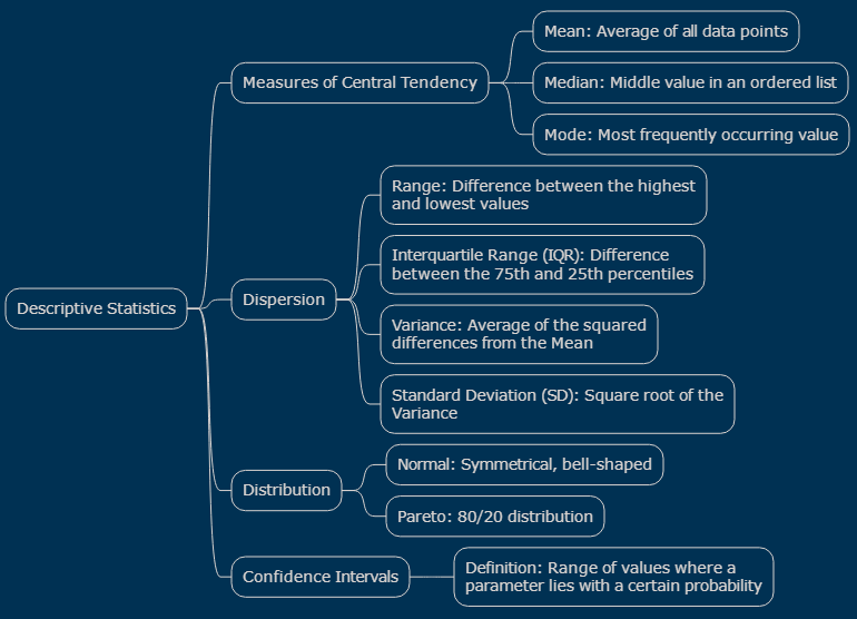
Graphic: Major Concepts of Descriptive Statistics
Getting to Know Our Data with Pandas
This chapter was prepared using a Python library called “Pandas”, which is widely used for statistics. While you don’t need to know how to use these tools to read this chapter, they are a great resource for anybody who wants to work with data and statistics, either at school or in the work force. You can open the “Colab” version of this chapter here:
Below, I’ll briefly review the steps for loading the data into Pandas.
Step 1: Loading the Dataset into a DataFrame
First, we need to load our dataset into a structure called a DataFrame, which Pandas uses to store and manipulate data in a tabular form. Here’s how you can do it:
import pandas as pd
url = ‘https://github.com/brendanpshea/A-Little-More-Logical/raw/main/data/high_school_werewolf_data.csv’
school_df = pd.read_csv(url)
In the Google Colab version of this chapter, you can run this cell by pressing the ‘Play’ button or use the shortcut Shift + Enter to run the cell. This will execute the code, import Pandas, and load the dataset into a DataFrame named school_df.
Step 2: Viewing the First Few Rows of the Dataset
Once the dataset is loaded, it’s a good practice to view the first few rows. This helps us get an initial feel for the data – the columns, the type of values, and so on. You can do this by using the head() function in Pandas. In a new cell, we can type this:
print(school_df.head())
Sex Height EyeColor FullMoonAbsence GPA WerewolfParents \
0 Male 71.79 Blue 5 2.82 0
1 Female 62.05 Blue 1 3.67 0
2 Male 70.14 Brown 1 3.79 0
3 Male 70.83 Green 0 2.62 0
4 Male 70.68 Brown 2 2.54 0
Detentions IsWerewolf Homeroom
0 1 True 10-A
1 1 False 10-A
2 0 False 10-A
3 0 False 10-A
4 6 False 10-A
Running this command will display the first five rows of our dataset. Later, we’ll be creating a subset of this to represent a particular “class.” But for now, we’ll be focusing on the school as a whole.
Data Dictionary for High School Werewolf Dataset
A data dictionary is a document that explains the variables in a dataet. The dataset simulates a 2,000 student high school with a twist: some students are werewolves. The dataset (created specificalyl for this textbook) is designed for educational purposes, allowing students and teachers to explore statistical concept.
Sex is a categorical variable indicating the gender of the student. Possible values are ‘Male’ and ‘Female’.
Height is a continuous variable representing the student’s height in inches. Heights follow a normal distribution.
EyeColor is a categorical variable indicating the eye color of the student. Possible values are ‘Brown’, ‘Blue’, ‘Green’, ‘Grey’, and ‘Yellow’. Yellow eyes are a unique trait found only among werewolves.
FullMoonAbsence is a discrete variable representing the number of days the student was absent after a full moon.
GPA is a continuous variable representing the student’s Grade Point Average.
WerewolfParents is a discrete variable indicating the number of the student’s parents who are werewolves.
Detentions is a discrete variable indicating the number of times the student has been in detention.
IsWerewolf is a binary variable indicating whether the student is a werewolf or not. Possible values are True (werewolf) or False (non-werewolf).
Measures of Central Tendency
In statistics, measures of central tendency are used to identify the center of a data set, giving us a representative value that defines the middle of the data distribution. These measures are crucial in summarizing a large set of data with a single value that represents the entire group. In this section, we’ll explore three primary measures of central tendency: mean, median, and mode.
Mean
The mean is the most commonly known measure of central tendency. It is calculated by adding all the values in a data set and then dividing by the number of values. The mean provides a useful overall measure when the data is uniformly distributed without extreme values (outliers).
Example: To calculate the mean height of students in our dataset, add all the students’ heights together and then divide by the total number of students. If five students have heights in inches of 60, 62, 65, 68, and 70, the mean height is (60 + 62 + 65 + 68 + 70) / 5 = 65 inches.
Median
The median is the middle value in a data set when it’s arranged in ascending or descending order. If there is an even number of observations, the median is the average of the two middle values. The median is particularly useful when dealing with data that have outliers, as it is not as affected by them as the mean.
Example: To find the median height, sort the heights and pick the middle one. If our heights are 60, 62, 65, 68, and 70 inches, the median is 65 inches (the third value). If there’s an additional height of 66 inches, the median is the average of the two middle values: (65 + 66) / 2 = 65.5 inches.
Mode
The mode is the most frequently occurring value in a data set. A data set may have one mode, more than one mode, or no mode at all. The mode is especially useful for categorical data where we want to know which is the most common category.
Example: In determining the mode for eye color in our dataset, if ‘Brown’ occurs most frequently among the students, then ‘Brown’ is the mode. If ‘Brown’ and ‘Blue’ are equally common, the data set is bimodal, and both colors are modes.
Why and How to Use Each Measure
Each measure of central tendency gives a different perspective on the data:
Use the mean for a quick, general understanding of the dataset, especially when the data distribution is symmetrical without outliers.
Use the median to find the middle of the dataset, especially when the data has outliers or is not symmetrically distributed.
Use the mode to understand the most common category or value in your dataset, particularly with categorical data.
Understanding these measures helps you analyze datasets like our High School Werewolf Dataset effectively. They provide a simple yet powerful way to summarize and interpret large amounts of data, offering insights that might not be immediately apparent.
How Do Werewolves Differ From Non-Werewolves?
This section will delve into the differences between werewolves and non-werewolves in our High School Werewolf Dataset. Our goal is to use Pandas, a powerful data analysis tool in Python, to explore measures of central tendency – specifically mean, median, and mode. These measures will help us understand the typical characteristics within each group, shedding light on how werewolves stand apart from their non-werewolf peers.
Calculating Means
The mean offers a general understanding of average values in each group.
mean_values = school_df.groupby(‘IsWerewolf’).mean(numeric_only=True)
print(round(mean_values,2))
Height FullMoonAbsence GPA WerewolfParents Detentions
IsWerewolf
False 66.69 1.14 3.11 0.07 7.75
True 68.30 2.38 3.12 0.27 6.78
Let’s also make a bar graph of this data. Bar graphs are ideally suited to this sort of task (comparing the mean values of numberical variables according to some category).
import matplotlib.pyplot as plt
mean_values.plot.bar(
subplots=True,
layout=(2,3),
title=“Mean Values by Werewolf Status”,
legend=False)
plt.show()
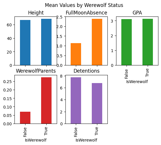
The mean values we’ve obtained from the High School Werewolf Dataset provide some interesting insights into the differences and similarities between werewolf and non-werewolf students. Let’s break down what each of these means tells us:
Height: Non-werewolves have an average height of 66.69 inches, while werewolves average 68.30 inches. This suggests that werewolf students are generally taller, aligning with the myth of werewolves being larger figures.
FullMoonAbsence: Non-werewolves are absent about 1.14 days after a full moon, whereas werewolves are absent 2.38 days on average. This higher absence rate for werewolves humorously aligns with their supposed nocturnal activities during full moons.
GPA: Non-werewolves have an average GPA of 3.11, and werewolves have an average GPA of 3.12. This indicates that there is virtually no difference in academic performance between werewolf and non-werewolf students.
WerewolfParents: Non-werewolves have an average of 0.069 werewolf parents, while werewolves have an average of 0.274. This suggests that werewolf students are more likely to have werewolf parents, hinting at hereditary traits.
Detentions: Non-werewolves average 7.75 detentions, while werewolves average 6.78. Contrary to expectations, werewolf students have fewer detentions, challenging the stereotype of werewolves as more prone to mischief.
Medians
Now, let’s do the same thing for medians:
median_values = school_df.groupby(‘IsWerewolf’).median(numeric_only=True)
print(round(median_values,2))
Height FullMoonAbsence GPA WerewolfParents Detentions
IsWerewolf
False 66.85 1.0 3.13 0.0 2.0
True 68.34 2.0 3.17 0.0 2.0
# A bar graph
median_values.plot.bar(
subplots=True,
layout=(3,2),
title=“Median Values by Werewolf Status”,
legend=False)
plt.show()
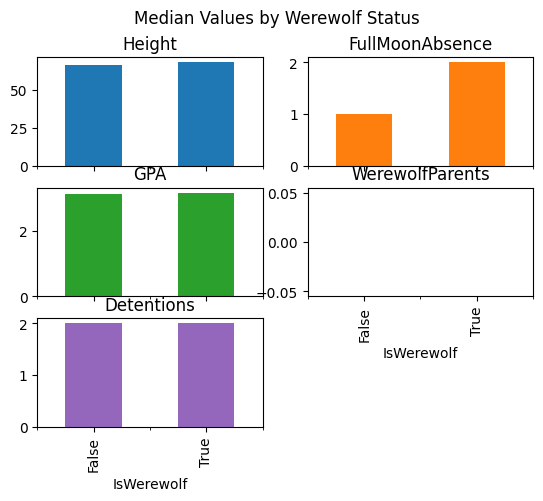
The median values from the High School Werewolf Dataset offer another perspective, particularly highlighting where and why they differ from the mean values. Let’s analyze these medians:
Height: Non-werewolves have a median height of 66.85 inches, while werewolves have a median height of 68.345 inches. Similar to the mean, the median height for werewolves is greater, reaffirming that werewolves are generally taller. The closeness of the median to the mean suggests a fairly symmetric distribution of height within both groups.
FullMoonAbsence: Non-werewolves have a median absence of 1.0 day after a full moon, while werewolves have a median of 2.0 days. The median values are lower than the mean, especially for werewolves, indicating that a few students with very high absences pull up the average. Most werewolf students miss fewer days.
GPA: Non-werewolves have a median GPA of 3.13, and werewolves have a median GPA of 3.17. The median GPAs are very close to the means, suggesting a symmetric distribution of GPA scores among both groups, with no significant outliers affecting the average.
WerewolfParents: The median number of werewolf parents is 0.0 for both non-werewolves and werewolves. This aligns with the mean, indicating that the majority of students, whether werewolves or not, do not have werewolf parents.
Detentions: Both non-werewolves and werewolves have a median number of detentions of 2.0. The median detentions are much lower than the mean, especially for non-werewolves, suggesting that the average number of detentions is influenced by a few students with very high detention counts. This disparity indicates a right-skewed distribution: most students have fewer detentions, but a few outliers increase the mean.
Medians are less affected by outliers and skewed distributions than means. In cases where the data is not symmetrically distributed, or where there are extreme values (outliers), the median can provide a more accurate representation of the ‘typical’ data point than the mean. This is evident in our analysis of FullMoonAbsence and Detentions, where the medians suggest that most students’ experiences differ from what the mean implies due to the influence of outliers.
Modes
The mode is generally used for categorical data (such as eye color) as opposed to numerical data (such as GPA, height, etc). Let’s take a look at how eye color is distributed.
eye_color = school_df.groupby(‘IsWerewolf’)[‘EyeColor’].value_counts().unstack()
print(eye_color)
EyeColor Blue Brown Green Grey Yellow
IsWerewolf
False 452.0 577.0 318.0 153.0 NaN
True 131.0 133.0 83.0 50.0 103.0
# A bar graph
eye_color.T.plot.bar(grid=True,
title=“Eye Color Distribution”)
<Axes: title={‘center’: ‘Eye Color Distribution’}, xlabel=’EyeColor’>
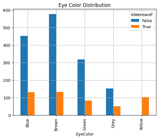
The mode, as the most frequently occurring value in a dataset, is particularly useful for analyzing categorical data. In this case, we’re looking at the distribution of eye color among werewolf and non-werewolf students. This analysis not only tells us which eye color is most common in each group but also highlights the importance of considering proportions when interpreting categorical data.
From the value_counts() output, we can see the following:
Non-Werewolves:
Most common eye color is Brown (577 students).
Followed by Blue (452 students), Green (318 students), and Grey (153 students).
Werewolves:
Most common eye color is still Brown (133 students), closely followed by Blue (131 students).
Notably, Yellow eyes, a unique trait among werewolves, occur significantly (103 students).
Other colors like Green (83 students) and Grey (50 students) are also present but less frequent.
When analyzing categorical data like eye color, it’s important to consider proportions in addition to the raw counts. This helps us understand the distribution of categories within the context of the entire group. For instance, while Brown is the most common eye color among both werewolves and non-werewolves, the proportion of Yellow eyes is notably high among werewolves, a unique feature not seen in non-werewolves.
To gain a clearer understanding of these proportions, you can produce a normalized table that calculates the percentage of each eye color within werewolf and non-werewolf groups. Let’s see how this looks:
eye_color_proportions = school_df.groupby(‘IsWerewolf’)[[‘EyeColor’]].value_counts(normalize=True).unstack().round(2)
print(eye_color_proportions)
EyeColor Blue Brown Green Grey Yellow
IsWerewolf
False 0.30 0.38 0.21 0.1 NaN
True 0.26 0.27 0.17 0.1 0.21
# A bar graph
eye_color_proportions.T.plot.bar(grid=True,
title=“Eye Color Proportions”)
<Axes: title={‘center’: ‘Eye Color Proportions’}, xlabel=’EyeColor’>
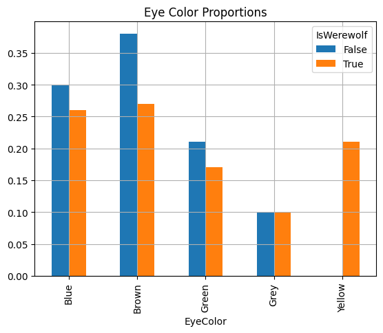
The proportions table provides a nuanced view of the distribution of eye colors among werewolf and non-werewolf students, translating raw counts into relative frequencies. This table helps to understand the prevalence of each eye color within these specific groups.
This table highlights that while brown eyes are most common among non-werewolves, the distribution is more even among werewolves, with a significant presence of yellow eyes exclusive to werewolves.
Table: Mean, Median, and Mode
|
Statistic |
Description |
Uses |
|
Mean |
The average of a set of numbers, calculated by adding them together and dividing by the count of numbers. |
Ideal for finding the average value in a normally distributed data set. |
|
Median |
The middle value in a list of numbers, providing a central point that divides the data set in half. |
Useful in understanding the central tendency of skewed data sets, as it is less affected by outliers compared to the mean. |
|
Mode |
The most frequently occurring number(s) in a set of data. For categorical data, it identifies the most common category. |
Helpful for identifying the most common value or category within a data set. |
Case Study: Correlation and Causation at Full Moon High
At Full Moon High, a group of enthusiastic but somewhat bumbling researchers embarked on a mission to uncover the mysteries behind the school’s unique student body. Led by Dr. Hazel Howler, an ambitious but inexperienced researcher, the team included Max, who often got sidetracked, Luna, who believed in every conspiracy theory imaginable, and Felix, who was more interested in his phone than in the research.
Dr. Howler’s team aimed to investigate unusual patterns among the students. Rumors suggested that werewolf students had higher rates of detentions, more frequent absences after full moons, and similar academic performance to their non-werewolf peers. The team sought to determine whether being a werewolf caused these behaviors or if other factors were at play.
Despite their enthusiasm, the researchers faced challenges. Max misplaced data sheets, Luna insisted on interviewing students about alien abductions, and Felix suggested investigating cafeteria food quality instead.
Initial Findings
The compiled data revealed intriguing correlations:
Werewolf students were taller on average.
Werewolf students had more absences following a full moon.
No significant difference in GPA between werewolf and non-werewolf students.
Werewolf students were more likely to have werewolf parents.
Werewolf students had slightly fewer detentions on average.
Misguided Hypotheses
Dr. Howler’s team, eager to interpret their findings, proposed several misguided hypotheses:
Max suggested that perhaps non-werewolves were because they disliked the taste of cafeteria food (and thus ate less), leading to the erroneous belief that it was eating more food that made werewolf students taller. They ignored the possibility that genetic differences might account for differences in height (and that this caused the werewolf students to be hungrier!).
Luna hypothesized that werewolf students might be more absent after full moons because they needed time to recover from alien abductions (which, of course, they couldn’t remember), completely overlooking the more plausible explanation of nocturnal activities associated with werewolf lore.
Feliux believed that werewolf students received fewer detentions because they were more disciplined, while Felix thought it was due to fear of werewolves by teachers, neglecting to explore the possibility that behavioral interventions could be more effective among werewolf students. (Or that the very small difference in detentions was simply due to a small sample size that was being affected by small number of outliers).
Realization and Correction
After several weeks of chaotic research and accumulating more outlandish theories, Dr. Howler called for a meeting to address their methodological flaws. She highlighted the key issues:
Bias. The team had preconceived notions about werewolves, influencing their interpretations. Dr. Howler emphasized the need for an unbiased approach.
Confounding Variables. Other factors, such as home environment, genetics, or teacher behavior, could influence the observed outcomes. Dr. Howler pointed out that these needed to be controlled for to draw accurate conclusions.
Small Sample Size. The limited number of werewolf students made it difficult to draw definitive conclusions. Increasing the sample size was crucial for more reliable results.
Measurement Error. Max’s data mishandling and Luna’s unconventional interviews introduced inaccuracies. Dr. Howler stressed the importance of precise data collection methods.
Interventionist Approach
Dr. Howler proposed adopting an interventionist approach to distinguish correlation from causation. This involved actively manipulating one variable to observe changes in another, under controlled conditions. For example:
To test the impact of full moons on absences, they could compare absenteeism in two groups of werewolf students: one experiencing a full moon and one not.
To examine the role of cafeteria food, they could monitor changes in height and behavior after modifying the diet for a controlled period.
Conclusion
Despite their bumbling efforts, the team learned valuable lessons about the complexities of distinguishing correlation from causation. Their findings highlighted the importance of rigorous methodology and the pitfalls of jumping to conclusions based on correlations alone.
Dr. Howler concluded with a note of caution: “While patterns and connections are intriguing, understanding true causation requires careful, focused research. We must account for biases, confounding variables, and ensure our sample sizes are adequate. Until then, let’s keep our minds open and enjoy the mysteries at Full Moon High.”
Questions
In the werewolf dataset, we saw that werewolves tended to be taller on average than non-werewolves. Can you think of a real-world example where comparing averages between two groups might be useful? What are some potential pitfalls or limitations of this type of comparison?
The median number of detentions was lower than the mean for both werewolves and non-werewolves, suggesting that a few students with many detentions were skewing the average. Can you describe a real-life situation where the median might be a better measure of central tendency than the mean? Why?
In the dataset, yellow eyes were a unique trait among werewolves. In the real world, what are some examples of rare or unique characteristics that might be associated with certain groups? How might this information be used positively (e.g., to target medical treatments) or negatively (e.g., to discriminate)?
Suppose a school district wanted to collect data on students’ “werewolf status” (or some other sensitive personal characteristic). What ethical concerns would this raise? How might the district ensure that the data is collected and used responsibly?
Imagine that a city’s crime data shows a few neighborhoods with much higher crime rates than others. How might this affect the city’s overall crime statistics? What are some potential causes of these “outlier” neighborhoods, and how might the city address them?
Measuring of Dispersion
In any statistical analysis, understanding the spread or variability of the data is just as crucial as knowing the central tendency. Measures of dispersion provide us with insights into the extent of variability within our data set. They help us understand how much the data points differ from the average and from each other. In this section, we will explore key measures of dispersion—range, interquartile range (IQR), variance, and standard deviation—using the High School Werewolf Dataset.
Range
The range gives us the difference between the highest and lowest values in our data set. It’s the simplest measure of dispersion.
Example: If the tallest student in our dataset is 78 inches tall and the shortest is 54 inches, the range of student heights is 78 – 54 = 24 inches.
Interquartile Range (IQR)
The interquartile range (IQR) measures the spread of the middle 50% of the data. It is calculated as the difference between the 75th percentile (Q3) and the 25th percentile (Q1). The IQR is particularly useful for understanding the spread of the central portion of a dataset and is less affected by outliers than the range.
Steps to calculate the IQR:
Arrange the data in ascending order.
Determine the first quartile (Q1), which is the median of the first half of the data.
Determine the third quartile (Q3), which is the median of the second half of the data.
Calculate the IQR by subtracting Q1 from Q3: IQR = Q3 – Q1.
Example: In the context of GPA, if Q1 (25th percentile) is 2.8 and Q3 (75th percentile) is 3.6, the IQR is 3.6 – 2.8 = 0.8. This indicates the spread of the middle 50% of GPAs.
Variance and Standard Deviation
Variance measures the average degree to which each point differs from the mean. It provides a way of quantifying the spread of all data points in the dataset. Standard deviation is the square root of the variance and provides a measure of dispersion in the same units as the data, making it more interpretable.
Steps to calculate variance:
Calculate the mean
of the data set.
Subtract the mean from each data point and square the result:
Sum all the squared differences:
.
Divide by the number of data points (for population variance) or by the number of data points minus one (for sample variance):
Population variance:
Sample variance:
Steps to calculate standard deviation:
Compute the variance.
Take the square root of the variance:
(for population) or
(for sample).
Example: Calculating Variance and Standard Deviation
Example: Calculating the variance of detention numbers will tell us how much the number of detentions students receive varies from the average number of detentions. If the average number of detentions is 3, and we have the following number of detentions: 1, 3, 4, 4, 5:
!wget https://github.com/brendanpshea/A–Little–More–Logical/raw/main/tools/logic_util.py –q –nc
from logic_util import *
data = [1, 3, 4, 4, 5]
calculate_variance(data)
Original List: [1, 3, 4, 4, 5]
Step 1: Calculate the mean of the list: 3.4
Step 2: Subtract the mean from each data point and square the result: [5.76 0.16 0.36 0.36 2.56]
Step 3: Sum all the squared differences: 9.2
Step 4: Divide by the number of data points minus one (for sample variance): 2.3
Step 5: Take the square root to get the standard deviation: 1.52
Measures of Dispersion at Full Moom High
Now, let’s take a look at how the data at Full Moon High is dispersed.
print(school_df.describe().round(2))
Height FullMoonAbsence GPA WerewolfParents Detentions
count 2000.00 2000.00 2000.00 2000.00 2000.00
mean 67.09 1.45 3.11 0.12 7.51
std 4.03 1.66 0.51 0.39 20.55
min 54.49 0.00 0.97 0.00 0.00
25% 64.34 0.00 2.77 0.00 0.00
50% 67.16 1.00 3.13 0.00 2.00
75% 70.02 2.00 3.47 0.00 6.00
max 78.33 8.00 4.00 2.00 180.00
From the given statistics, we can derive several insights about the dispersion of various attributes in the High School Werewolf Dataset:
Height
The range of student heights is from 54.49 inches to 78.33 inches, a span of 23.84 inches.
The standard deviation (std) is 4.03 inches, indicating that most student heights vary by about 4 inches from the mean height of 67.09 inches.
The Interquartile Range (IQR), calculated as Q3 (70.02 inches) – Q1 (64.34 inches), is 5.68 inches, suggesting that the middle 50% of the students’ heights are within this range.
Full Moon Absence
The range of absences is from 0 to 8 days.
The standard deviation is 1.66 days, showing a moderate variation in the number of days students are absent after a full moon.
The IQR, found by subtracting Q1 (0 days) from Q3 (2 days), is 2 days, meaning the middle 50% of the students’ absences fall within this range.
GPA
GPAs range from a low of 0.97 to a high of 4.00.
The standard deviation is 0.51, indicating that GPAs generally vary by about half a point from the mean GPA of 3.11.
The IQR is 3.47 – 2.77 = 0.7, showing that the middle 50% of GPAs are quite tightly packed.
Werewolf Parents
The number of werewolf parents ranges from 0 to 2.
The standard deviation is 0.39, suggesting some variation, though the majority of students have 0 werewolf parents, as indicated by the median (50%) and the first quartile (25%).
The IQR is 0, which, along with a median of 0, implies that most students do not have werewolf parents.
Detentions
The range for detentions is quite wide, from 0 to 180.
The standard deviation is high at 20.55, indicating a significant variation in the number of detentions among students.
The IQR is 6 – 0 = 6, but given the high range and standard deviation, this suggests that while most students have few detentions, a small number of students have a very high number of detentions, possibly skewing the mean.
In summary, these measures of dispersion reveal that while some attributes like GPA and height show relatively low variability among students, others, such as the number of detentions, exhibit a much broader range of values. This variation highlights the diversity within the student population and underscores the importance of considering both central tendency and dispersion for a comprehensive understanding of any dataset.
Are Werewolves “Normal”? It Depends on the Distribution
In statistics, understanding how data is distributed is crucial for interpreting and analyzing that data effectively. A distribution in statistics is essentially a map that shows the frequency of each value or range of values within a dataset. It helps to identify patterns, anomalies, and the overall behavior of data, playing a vital role in the decision-making process based on that data. Whether in scientific research, business analytics, or social sciences, the way data is spread out or clustered can reveal significant insights about the underlying phenomena.
The normal distribution, often referred to as the Gaussian distribution, is particularly important due to its common occurrence in many natural and human-made phenomena. This distribution is characterized the following:
It is characterized by the following features:
Symmetrical Shape. The left and right sides of the distribution are mirror images of each other.
Bell Curve. The distribution follows a bell-shaped curve, with most values clustering around a central mean and fewer occurring as you move away from the center.
Mean, Median, and Mode. In a perfectly normal distribution, the mean, median, and mode of the dataset are all equal, lying at the center of the distribution.
The Empirical (68-95-99.7) Rule. In a normal distrbution, around 68% of the data points will fall within one standard deviation of the mean, 95% of the data points will fall within two standard deviations of the mean, and 99.7% will fall within three standard deviations of the mean.
Real-world examples of the normal distribution are abundant and varied, reflecting its fundamental role in many fields:
Human characteristics such as height, weight, and blood pressure typically follow a normal distribution. Most people fall within a certain average range, while fewer individuals lie at the extreme ends (very tall, very short, very high or low blood pressure).
In education and psychology, test scores, such as IQ scores or SAT scores, often show a normal distribution pattern. The majority of people score around the average, with decreasing frequencies of very high or very low scores.
Many economic indicators like household income or inflation rates in a stable economy tend to be normally distributed. Most households earn around an average income, with fewer at the extreme ends of wealth or poverty.
In statistical modeling, the residuals (differences between observed and predicted values) often follow a normal distribution, a key assumption in many modeling techniques.
In the context of the “Statistics With Werewolves” dataset, examining whether certain attributes, such as student heights or GPAs, follow a normal distribution is an engaging way to apply and understand this concept. For example, we might expect that the heights of the students, werewolf or not, would closely follow a normal distribution, clustering around a mean value with fewer students at the extremely tall or short ends. Similarly, GPA scores might also be normally distributed, indicating that most students achieve around the average score, with fewer students attaining very high or very low GPAs.
The significance of identifying a normal distribution in this dataset—or in any dataset—stems from the fact that many statistical methods assume normality. This assumption allows for the application of various analytical techniques, such as hypothesis testing or regression analysis, which rely on the properties of the normal distribution. Understanding whether or not a dataset follows a normal distribution can thus influence how we analyze the data and the types of conclusions we can draw from it.
Exploring Distributions with Histograms
Histograms are invaluable tools in statistics for visualizing the distribution of data. They help us understand the shape, spread, and central tendency of data by displaying the frequency of data points within specified ranges or ‘bins.’ Let’s delve into how histograms can be used to explore distributions, particularly focusing on Height (which is normally distributed) versus and Detentions (which has a very different distribution) in the High School Werewolf Dataset.
Heights are Normally Distributed
Height is expected to follow a normal distribution. To visualize this, we can plot a histogram using Pandas:
school_df[“Height”].plot.hist(
title=“Distribution of Heights”,
xlabel=“Height(in)”)
plt.show()
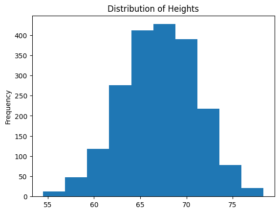
This histogram represents the distribution of data points over a certain range. Here’s how to interpret the diagram and how it illustrates a normal distribution:
The horizontal axis (X-axis) represents bins or intervals for the variable being measured—in this case, it could be height, weight, or another metric measured on a continuous scale. Each bin groups the data within a specific range of values.
The vertical axis (Y-axis) shows the frequency, which is the number of data points that fall within each bin. The height of each bar corresponds to the frequency of the data points in that particular range.
The overall shape of the bars resembles the characteristic bell curve of a normal distribution. This is evident from the following observations:
Symmetry: The bars form a symmetrical shape around a central value, which would be the mean of the data.
Central Peak: There is a clear peak where the tallest bar(s) are located, indicating the mode of the data—the most common value(s) or range of values. In a normal distribution, this peak corresponds to the mean and median as well.
Tapering Sides: As the values increase or decrease from the mean, the frequency decreases, creating the tapered sides of the bell curve.
This histogram suggests a normal distribution due to its symmetry and bell shape. In a perfectly normal distribution, data is evenly distributed around the mean, with no skew to the left or right.
To sum up, this histogram likely represents a normally distributed variable, with most data points clustered around the mean, and fewer data points as you move away from the center. This pattern suggests that extreme values are less common than values near the mean, which is a hallmark of normally distributed data.
We could also break this down by werewolves and non-werewolves:
school_df.groupby(“IsWerewolf”)[“Height”].plot.hist(
title=“Distribution of Heights by Werewolf Status”,
xlabel=“Height(in)”,
legend = True,
density=True, # Use relative frequency
alpha = .5 # Make colors semi-transparent
)
plt.show()
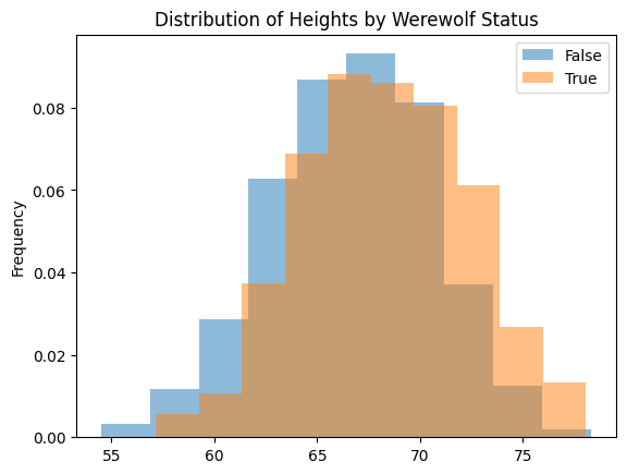
This diagram shows two “bell curves”, both of which are symmetrical. The werewolf curve (“True”) is slight to the right of the non-werewolf curve (“False”) reflecting the fact that werewolves are, on average, slightly taller than non-werewolves. You might also notice the y-axis (“Frequency”) is expressed in terms of relative frequency (a number between 0 and 1, represetning the proportion of the students) rather than absolute frequency (a count of students). This helps account for the fact that there are many more non-werewolf students than there are werewolves.
Detentions are Not Normally Distributed
In contrast to heights, detentions are NOT normalyl distributed, as we can see from the following histogram:
school_df[“Detentions”].plot.hist(
title=“Detentions Are Not Normal”,
xlabel=“Detentions”)
plt.show()
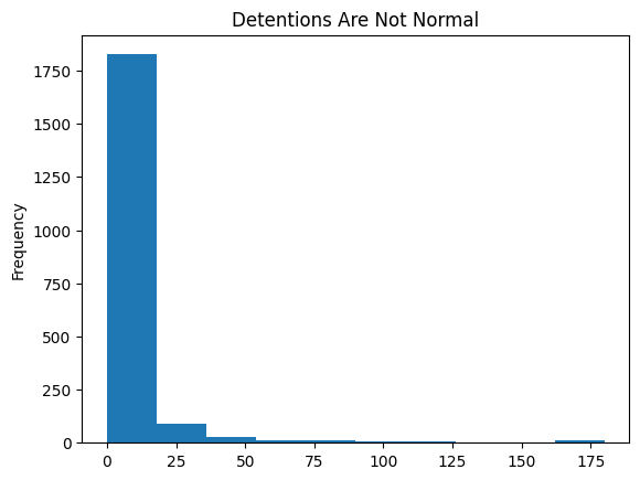
This histogram suggests that detentions follow what is sometimes called a Pareto distribution, which is also known colloquially as the 80/20 rule. This is an important type of non-normal distribution. Here’s how the histogram aligns with the characteristics of a Pareto distribution:
The tallest bar is at the lower end of the detention range, indicating that a large number of students have few detentions. This reflects the ’80’ part of the “80/20 rule”, where the majority (or a large segment) of the population has a low number of detentions.
The histogram shows a long tail extending to the right. Although fewer students fall into these higher detention categories, the tail demonstrates that there is a small but significant number of students with a high number of detentions. (For example, in a normal distribution, it would be VERY VERY unlikely for any student to have more than 50 detententions). This aligns with the ’20’ part of the “80/20 rule”, indicating that a smaller percentage of the population accounts for a large number of detentions.
The data is right-skewed, as indicated by the bars decreasing in height as we move to the right. This skewness is typical of a Pareto distribution where there are many occurrences of low-frequency events (few detentions) and few occurrences of high-frequency events (many detentions).
Pareto In Practice
Pareto distributions, or the “80/20 rule”, play a significant role in various real-life scenarios and are crucial in many fields of study and industry sectors. This rule of thumb states that, for many events, roughly 80% of the effects come from 20% of the causes. Here’s why understanding these types of distributions is important:
Perhaps the most famous example is in wealth distribution. Often, a large portion of a country’s wealth is held by a small percentage of the population. This understanding helps economists and policymakers design tax systems and social welfare programs.
Many businesses find that 80% of their sales come from 20% of their customers. This knowledge can guide marketing strategies, product development, and customer relationship management to focus resources on the most profitable segments.
In manufacturing and production, the Pareto principle can be observed where a majority of production defects or quality issues often arise from a small number of causes. Identifying and addressing these can significantly improve quality and efficiency.
Law enforcement agencies have observed that a small percentage of criminals commit a large percentage of crimes. This insight allows for more targeted crime prevention strategies and resource allocation.
In healthcare, a small number of patients often account for a large proportion of healthcare resource usage, such as hospital beds or medical costs. Understanding this distribution helps in managing healthcare systems and improving patient care.
Pareto distributions also govern things like alchol or drug consumption (a minority of the population consume a majority of these), church attendance, political news consumption, and many other things. In all these cases, it is easy to make (costly) mistakes if we assume that these values are distributed normally (as we humans tend to do!). Once we recognize that this isn’t the case, we can act accordingly.
Case Study: Election Polling at Full Moon High
Luna Lupine and Howl Hackles, ace reporters for the Full Moon High Gazette, are preparing to poll students about proposed policies for the upcoming school election. The most controversial proposal is keeping the cafeteria open all night during the full moon to cater to the werewolf students’ nocturnal appetites.
“Howl, we need to make sure our poll is representative of the whole school,” Luna says as they plan their survey. “We can’t just ask the werewolves what they think!”
Howl nods. “You’re right. We need a random sample that gives every student an equal chance of being selected. That way, we can infer the opinions of the entire student body based on our sample.”
They decide to survey a sample of 100 students. After conducting the poll, they find that 65% of the sampled students support the proposal.
“So, can we say that 65% of the whole school is in favor?” Howl asks.
Luna shakes her head. “Not exactly. Our sample proportion of 65% is just an estimate. There’s always some uncertainty when inferring from a sample to a population.”
This uncertainty is quantified by the margin of error. With a sample size of 100 and a 95% confidence level, Luna calculates the margin of error to be approximately ±12%.
“This means that we’re 95% confident that the true proportion of students supporting the proposal falls between 53% and 77%,” Luna explains. “The margin of error shows the precision of our estimate.”
Howl furrows his brow. “What does ‘95% confidence’ mean?”
“It’s the probability that our interval estimate contains the true population proportion,” Luna clarifies. “If we repeated this survey many times, 95% of the intervals calculated would contain the true value. Actually, to be more precise, we could be 95% accurate if our survey method were perfectly unbiased. So, it’s more like best-case estimate”
Howl considers this. “What if we want to be 99% confident?”
Luna runs the numbers. “A 99% confidence level would widen our margin of error to about ±15%. More confidence comes at the cost of less precision.”
Next, they discuss sample size. “What if we had surveyed 500 students instead of 100?” Howl wonders.
“A larger sample size would decrease our margin of error,” Luna replies. “With 500 students, our margin of error would be about ±5% at a 95% confidence level. But we have to balance precision with practicality.”
Finally, they consider potential sources of bias. “We need to watch out for sampling bias,” Luna cautions. “If we only survey werewolf students or those in night classes, our sample won’t represent the diverse views of the full moon student body.”
To ensure a representative sample, they employ stratified random sampling. They divide the student population into subgroups (like werewolves, vampires, humans) and randomly sample from each subgroup in proportion to its size.
“By understanding margin of error, confidence levels, sample size, and bias, we can report our findings responsibly,” Luna concludes. “These concepts are crucial for interpreting polls, not just at Full Moon High but in real-world situations like political campaigns or scientific studies.”
Howl grins. “Looks like we’re ready to publish! Our article will help students make an informed decision in the election.”
Discussion Questions
How do measures of dispersion, like range, interquartile range, variance, and standard deviation, help us understand the spread of data in a dataset? Provide examples from the High School Werewolf Dataset.-
Discuss the importance of considering both central tendency and dispersion when analyzing a dataset. How can focusing on just one aspect lead to an incomplete or misleading understanding of the data?
Explain the key characteristics of a normal distribution. Why is it important to identify whether a dataset follows a normal distribution?
Using the examples of height and GPA from the High School Werewolf Dataset, discuss how knowing the distribution of data can influence the way we analyze and interpret the data.
How do histograms help visualize the distribution of data? Describe the process of creating and interpreting a histogram using the example of student heights from the dataset.
Compare and contrast the distribution of heights and detentions in the High School Werewolf Dataset. What insights can we gain from observing the differences in their distributions?
Discuss the Pareto distribution (80/20 rule) and its real-life applications. How can understanding this type of distribution inform decision-making in various fields, such as business, healthcare, or law enforcement?
In the case study, Luna and Howl discuss the concepts of margin of error, confidence level, and sample size. Explain how these concepts are related and how they impact the interpretation of poll results.
Luna mentions that the confidence level doesn’t directly indicate the probability of their specific poll being accurate. Discuss the nuanced interpretation of confidence level and why it’s important to communicate this clearly when reporting poll results.
Minds that Mattered: Rachel Carson
Rachel Carson (1907-1964) was an American marine biologist, environmentalist, and author whose groundbreaking work revolutionized our understanding of the interconnectedness of nature and the impact of human activities on the environment. Her meticulous research, compelling writing, and fearless advocacy helped inspire the modern environmental movement and raised public awareness about the dangers of uncontrolled pesticide use.
Born in rural Pennsylvania, Carson developed a deep love for nature at an early age. She pursued her passion for biology and writing at the Pennsylvania College for Women (now Chatham University) and later earned a master’s degree in zoology from Johns Hopkins University. Carson began her career as a scientist and editor at the U.S. Bureau of Fisheries (now the U.S. Fish and Wildlife Service) and eventually became a full-time nature writer.
Key Ideas
Carson’s most famous work, Silent Spring (1962), documented the devastating effects of widespread pesticide use, particularly DDT, on the environment and wildlife. The book’s title refers to a hypothetical future where the indiscriminate use of pesticides has destroyed bird populations, resulting in a “silent spring” devoid of birdsong. Carson meticulously gathered evidence from scientific studies, case reports, and personal accounts to build a compelling case against the uncontrolled use of pesticides. Using statistical reasoning, Carson demonstrated that pesticides were not only killing target insects but also accumulating in the food chain, harming birds, fish, and other wildlife. She argued that the long-term consequences of pesticide use were largely unknown and that the chemical industry’s claims of safety were based on inadequate testing and flawed reasoning. Silent Spring challenged the prevailing belief that technological progress was always beneficial and raised questions about the ethical responsibilities of scientists, government, and industry in protecting public health and the environment.
Throughout her work, Carson emphasized the complex web of relationships that exists in nature and the far-reaching consequences of human interventions. She argued that the indiscriminate use of pesticides not only harmed target species but also disrupted entire ecosystems, often with unintended and long-lasting effects. Carson’s holistic view of nature challenged the reductionist approach prevalent in much of 20th-century science, which tended to study individual components of ecosystems in isolation. By highlighting the interconnectedness of living systems, Carson helped shift scientific and public understanding towards a more ecological perspective that recognized the importance of biodiversity and the delicate balance of nature.
Carson’s ability to translate complex scientific concepts into engaging, accessible prose was crucial to the success of Silent Spring and her other works. She believed that scientists had a responsibility to communicate their findings to the public in a way that was both informative and compelling. Carson’s writing style combined rigorous scientific analysis with poetic descriptions of nature, creating a powerful emotional connection with her readers. By humanizing the abstract concepts of ecology and environmental science, Carson inspired a sense of wonder, appreciation, and stewardship for the natural world. Her work demonstrated the power of effective science communication to shape public opinion, influence policy, and drive social change.
Influence
Silent Spring is often credited with launching the modern environmental movement and raising public awareness about the unintended consequences of technological progress. The book’s publication sparked a national debate about the use of pesticides and led to significant changes in U.S. environmental policy, including the banning of DDT and the creation of the Environmental Protection Agency (EPA) in 1970.
Carson’s legacy extends beyond her impact on environmental policy. Her work inspired a new generation of scientists, environmentalists, and activists to think more critically about the relationship between humans and nature. She challenged the notion that science and technology could solve all problems and urged a more precautionary approach to environmental decision-making.
Today, Carson’s ideas continue to shape our understanding of environmental issues, from climate change and biodiversity loss to the impacts of pollution on human health. Her emphasis on the interconnectedness of living systems and the importance of science communication remains as relevant as ever in the face of complex global environmental challenges.
In the field of statistics, Carson’s work serves as a powerful example of the importance of rigorous data analysis, evidence-based reasoning, and the ethical responsibilities of scientists in informing public policy. Her use of statistical evidence to challenge prevailing assumptions and expose the limitations of industry-sponsored research has inspired generations of scientists to use their skills in the service of public good.
Discussion Questions
How did Rachel Carson use statistical reasoning and evidence in Silent Spring to build a case against the indiscriminate use of pesticides? What were some of the key findings that supported her argument?
In what ways did Carson’s holistic view of nature challenge the prevailing scientific paradigm of her time? How has her emphasis on interconnectedness influenced our current understanding of ecosystems and environmental issues?
Why was Carson’s ability to communicate complex scientific ideas to the general public so important to the success of Silent Spring and the environmental movement more broadly? What can modern scientists learn from her approach to science communication?
How did Silent Spring contribute to changes in U.S. environmental policy, and what is the significance of these changes for environmental protection efforts today?
In what ways does Carson’s legacy continue to influence environmental science, activism, and public policy? What are some of the key environmental challenges we face today, and how can we apply Carson’s ideas to address them?
Glossary
|
Term |
Definition |
|
Statistics |
The science of collecting, analyzing, presenting, and interpreting data, often involving the application of probability theory. |
|
Population |
The complete set of all elements or individuals under study in a statistical analysis. |
|
Sample |
A representative subset of a population, selected for the purpose of statistical analysis. |
|
Mean |
The sum of all values in a dataset divided by the number of values, representing the central tendency. |
|
Median |
The value separating the higher half and the lower half of a data sample; a measure of central tendency. |
|
Mode |
The value or values most frequently occurring in a dataset, indicating the highest point of a frequency distribution. |
|
Dispersion |
A quantitative measure of the extent to which values in a dataset are spread out or clustered together. |
|
Range |
The difference between the largest and smallest values in a dataset, indicating the spread of extreme values. |
|
Variance |
The average of the squared differences from the Mean, providing a measure of how far each value in the dataset is from the mean. |
|
Standard Deviation |
The square root of the variance, representing the average distance of each data point from the mean. |
|
Distribution |
The arrangement of a set of values showing their frequency or probability of occurrence. |
|
Normal Distribution |
A symmetric, bell-shaped distribution where the bulk of the values lie near the mean, often occurring in nature. |
|
Empirical Rule |
A statistical rule stating that for a normal distribution, about 68% of data fall within one standard deviation, 95% within two, and 99.7% within three. |
|
Pareto Distribution |
A power-law probability distribution used in describing phenomena in the social, scientific, geophysical, and actuarial fields. |
|
Outlier |
An observation that lies an abnormal distance from other values in a random sample from a population, often indicating variability. |
|
Statistical Syllogism (Inductive Generalization) |
A form of reasoning wherein a conclusion about a population is drawn from observations of a representative sample. It moves from specific instances to a generalized conclusion, inferring properties of the whole based on the properties observed in the sample. |
|
Confidence Level |
The probability, expressed as a percentage, that a statistical estimate is within a certain range. It quantifies the degree of certainty in the inductive inference from a sample to the population. |
|
Margin of Error |
The range of uncertainty around a sample statistic. It expresses the extent to which the results from the sample can be expected to differ from the true population parameter. |
|
Sampling Method |
The process used to select units from the population to be included in the sample. This method impacts the representativeness of the sample and, consequently, the validity of the inferences made about the population. |
|
Bias |
A systematic error in the data collection, analysis, interpretation, or review processes that results in a misrepresentation of the true characteristics of the population. It undermines the validity of the inductive generalization by skewing results away from the truth. |
References
Aschwanden, Christie. 2015. “Science Isn’t Broken: It’s Just a Hell of a Lot Harder Than We Give It Credit For.” FiveThirtyEight, August 19, 2015. https://fivethirtyeight.com/features/science-isnt-broken/.
Blastland, Michael, and Andrew Dilnot. 2009. The Numbers Game: The Commonsense Guide to Understanding Numbers in the News, in Politics, and in Life. New York: Gotham Books.
Ellenberg, Jordan. 2014. How Not to Be Wrong: The Power of Mathematical Thinking. New York: Penguin Press.
Gladwell, Malcolm. 2008. Outliers: The Story of Success. New York: Little, Brown and Company.
Gonick, Larry, and Woollcott Smith. 1993. The Cartoon Guide to Statistics. New York: HarperPerennial.
Huff, Darrell. 1993. How to Lie with Statistics. New York: W. W. Norton & Company.
Ioannidis, John P. A. 2005. “Why Most Published Research Findings Are False.” PLoS Medicine 2 (8): e124. https://doi.org/10.1371/journal.pmed.0020124.
Kahneman, Daniel. 2011. Thinking, Fast and Slow. New York: Farrar, Straus and Giroux.
Levitt, Steven D., and Stephen J. Dubner. 2005. Freakonomics: A Rogue Economist Explores the Hidden Side of Everything. New York: William Morrow.
Nuzzo, Regina. 2014. “Scientific Method: Statistical Errors.” Nature 506 (7487): 150–52. https://doi.org/10.1038/506150a.
Reinhart, Alex. 2015. Statistics Done Wrong: The Woefully Complete Guide. San Francisco: No Starch Press. https://www.statisticsdonewrong.com/.
Rosling, Hans. 2018. Factfulness: Ten Reasons We’re Wrong About the World–and Why Things Are Better Than You Think. New York: Flatiron Books.
Salsburg, David. 2001. “The Lady Tasting Tea: How Statistics Revolutionized Science in the Twentieth Century.” New York: W. H. Freeman. https://www.goodreads.com/book/show/852085.The_Lady_Tasting_Tea.
Silver, Nate. 2012. The Signal and the Noise: Why So Many Predictions Fail–but Some Don’t. New York: Penguin Press.
Spiegelhalter, David. 2019. The Art of Statistics: How to Learn from Data. New York: Basic Books.
Szucs, Denes, and John P. A. Ioannidis. 2017. “When Null Hypothesis Significance Testing Is Unsuitable for Research: A Reassessment.” Frontiers in Human Neuroscience 11: 390. https://doi.org/10.3389/fnhum.2017.00390.
Vigen, Tyler. 2015. “Spurious Correlations.” Accessed May 18, 2024. https://www.tylervigen.com/spurious-correlations.
Wheelan, Charles. 2013. Naked Statistics: Stripping the Dread from the Data. New York: W. W. Norton & Company.
