13.6 The Abstract Image
But what is it?
We keep coming back to this question, don’t we? It reflects a deeply engrained instinct for many viewers who expect art to create the illusion of realistic vision.
We’ve seen that, since the late 19th Century, Euro-American art has challenged that instinct with growing boldness. In Georges Braque and Pablo Picasso’s Cubism compositions, the visual subject is almost unrecognizable. And yet, Modern art was soon to take things even further. How, you ask?
Well, once you have radically deconstructed the visual subject, what more can you do? How about eliminating the subject altogether? What if one composed an image out of sheer form without attempting Representation on any level?
Abstract v Representation
What is it?
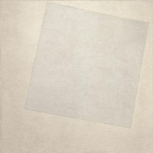 |
| Kazimir Malevich. (1918). Suprematist Composition: White on White. Oil on canvas. |
In terms of Mimetic Representation, it is nothing. Malevich is not attempting to naturalistically imitate a recognizable visual subject. For Malevich, however, the Composition holds forth a something of great important: an intense Formal and Expressive experience. The Content of the painting is Abstract.
The conceptual seeds of abstract art go back as far as Plato, 2,500 years ago. In the Philebus, Socrates says “I do not mean by beauty of form such beauty as that of animals and pictures…but straight lines and circles, and the plane or solid figures which are formed out of them … for these I affirm to be … eternally and absolutely beautiful.” The 19th Century English painter Joshua Reynolds wrote, “the beauty of form alone… makes of itself a great work, and justly claims our esteem and admiration” (Abstract Art, 2004).
Whatever you may think of Abstracts hanging in museums, you enjoy abstract designs in your home every day: Tartan plaids, polka dots, pin stripes, geometrical designs and more in clothing, wallpaper, and furniture coverings. Since about 1910, however, Abstract artists have asked us to suspend the What is it? question and take seriously the Aesthetic and Expressive possibilities of art that makes no attempt to represent anything.
Suprematism
We have seen that the Ukrainian painter Kazimir Malevich was so struck by Cézanne’s notion that the visual world is made up of geometrical shapes that he reduced images of human figures to sheer form (Woman with Pails: Dynamic Arrangement, 1913). In Cubism, he saw a similar reduction of the subject to rectangles and triangles. Out of these influences he developed a principle he called Suprematism, the “supremacy of pure feeling or perception in the visual arts” (quoted in Elderfield, 2004, p. 200).
“The artists can be a creator only when the forms in his picture have nothing in common with nature.” He did not use the term “abstract” for such works, however, but called them “non-objective” to indicate their complete liberation from representation; and he proclaimed Suprematism to be “the new realism in painting” (Elderfield, p. 201).
OK, we may be taken aback. What does this mean? How can mere shapes and colors comprise a supreme reality more true than imitations of something we might think of as real? Well, let’s give his Suprematist Compositions a chance. What do you think?
 |
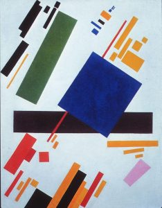 |
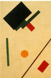
| Suprematist Composition. (1916). Oil on canvas. | Suprematist Composition X. (1916). Oil on canvas. |
Let’s just get this out of the way. These compositions don’t represent anything. Don’t try to break the code and figure out what the structures really are. OK, then what do we see?
Well, we see Formal Elements of art: Line. Shape. Color. And these elements are composed according to a clear intention. They align on a Compositional Line running diagonally from lower left to upper right. The direction is uplifting. Aspirational. Colors are juxtaposed to enhance relationships of contrast, complement, and affinity. Strategically placed bits appear out of line with the general parallel structure, creating tension and interest. The compositions force us to pay exclusive attention to the Formal Elements from which all visual composition is built.
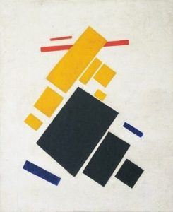
But you know it turns out to be hard to exclude Representation altogether. This next one seems to include a subject: an airplane.
 |
 |
| Suprematist Composition: Airplane Flying. (1915). | Suprematist Composition: White on White. (1918). |
Gotcha! The composition does not depict an airplane! Malevich, who was interested in aerial photography, was abstracting the experience of an overhead vision: “a yearning for speed, … for flight. … The blue color of the sky has been defeated by the Suprematist system, has been broken through and entered white, as the true, real conception of infinity” (Elderfield, p. 201).
Whoa! Did you see all of that? I surely didn’t. As we enter abstraction, the Signification of the work breaks free with greater and greater latitude for private reflection. What do we learn from the thoughts of the artist? Not, I think, how to view the work. Rather, we learn something of the freedom which comes from surrendering our commitment to the visual subject. We can approach those colors and lines and squares and let their design features play with our eyes and thoughts.
Malevich’s famous White on White composition seems to carry beyond the other clever bits of design. Its elegant simplicity, the subtle, mesmerizing interplay of shadings and Asymmetrical Balance keep pulling us back to deeper and deeper inspection. What is it? It is nothing less than the weighted impact of sheer Form.
Grids of Eternal Order: Piet Mondrian
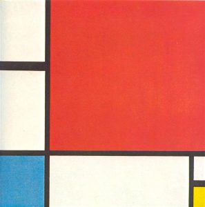
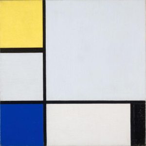
Before World War I, the Dutch painter Piet Mondrian painted landscapes and seascapes. Then, in Amsterdam during the war, he began to cultivate a purely formal, abstract style which he called Neo-Platicism:
Wow. That’s a pretty restrictive formula, eh? What do you think?
 |
 |
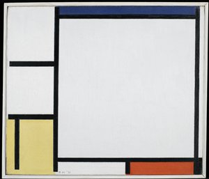 |
| Composition with Red, Blue, and Yellow. (1930). Oil on canvas. | Composition with Yellow, Blue, Black and Light Blue. (1922). Oil on canvas. | Composition with Blue, Red, Yellow, and Black. (1922). Oil on canvas |
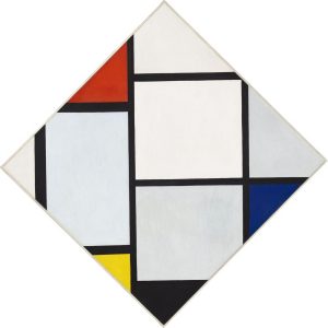
This is the same composition, over and over again, right? Except that it isn’t. The components are the same, as are the elements of a human face, but in scores of canvases Mondrian explored limitless variations, as diverse as the individual faces that throng the world. How many distinctives can you spot?
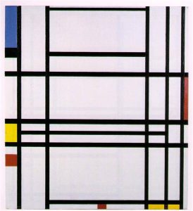
The more Mondrians we see, the more of a sense we get of his vision. He never seemed to tire of exploring variations, even adjusting in some cases the orientation of the frame. That 1943 canvas abstracts the excitement he felt listening to a jazz combo in a New York club to rhythms of color and shape.
 |
 |
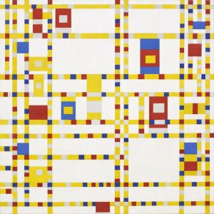 |
| Composition No 10. (1932). Oil on canvas. | Tableau No. IV; Lozenge Composition with Red, Gray, Blue, Yellow, and Black. (1925). | Broadway Boogie Woogie. (1943). Oil on canvas. |
The variations help us recognize the complexity of these designs. Notice in virtually every case the Asymmetrical Balance of the composition. Rectangles are unequal in size but balanced by the comparative weight of Positive Space and Negative Space. Dimensions are never equal and the dynamic tension between elements enlivens the composition. Exploring a Mondrian is an exercise in analyzing composition.
Kandinsky: the Abstract Breaks Free.
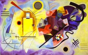
An Abstract is an exercise in Form. But which aspect of Form gains the ascendancy? For Wassily Kandinsky, it was always about Color.
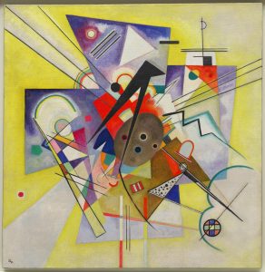
The title of Kaninsky’s Yellow, Red, and Blue suggests a purely formal, abstract composition. And indeed the powerful colors exert their spell along with deftly alternated geometric and organic shapes and lines. However, I’ll bet you can find represented subjects in the composition. Kandinsky pioneered abstract design while including elements of the natural.
 |
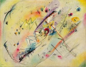 |
| Yellow, Red, Blue. (1925). Oil on canvas | Light Picture. (December 1913). Oil on canvas. |
 |
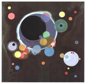 |
| Yellow Accompaniment. (1924). Oil on canvas. | Several Circles. (1926). Oil on canvas. |
There is much to see in a Kandinsky. You might even find suggestions of Representational subjects. But to be fair to the composition, one cannot be bound by the What is it? question. Color. Form. Design. How do they make you feel?
Flowers and the Desert: Georgia O’Keefe
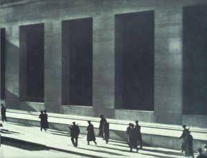
1n 1918, Georgia O’Keeffe did what many a young painter has done: she moved to New York to enter the mainstream of contemporary art. She fell in with Alfred Stieglitz’s circle of Modern artists and photographers. Fascinated by Paul Strand’s nearly abstract compositions, she told him that she was beginning to see things “as you might photograph them” (quoted in Benke, 1995, p. 23). Can you see the comparison?
 |
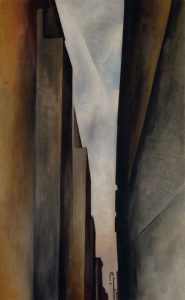 |
| Paul Strand. (1915). Wall Street. | Georgia O’Keefe. (1926). A Street. |
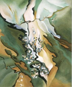
O’Keeffe and Stieglitz developed a close bond and eventually married. At the Stieglitz family lodge on Lake George in the Adirondacks, O’Keeffe explored the intersection of Form and Representation to be found in images of nature. What do you see in From the Lake No. 3? Do you see ambiguous depictions of vegetation and lakeshore? Or do you see sheer Organic Form? Or, perhaps, both?
 |
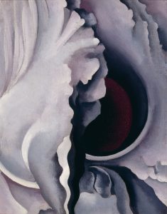 |
| From the Lake No. 3. (1924). Oil on canvas. | The Black Iris. (1921). Oil on canvas. |
O’Keefe increasingly focused her compositions on flowers. Her brush reveled in their sumptuous detail. At the same time, they pulse with the rhythms of intricately interwoven Line and Color. We can focus our vision on the flower, or we can get lost in sheer Form.
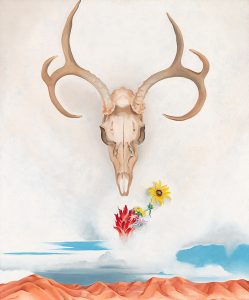
In 1929, O’Keefe visited a friend in Taos, New Mexico, an emerging artist colony. “Badlands roll away outside my door,” she wrote as she became fascinated by desert landscape (Benke, p. 57). She began to collect desert artifacts, including skulls of animals: “I have used these things to say what is to me the wideness and wonder of the world as I live in it” (Benke, p. 57). Travelling annually between Taos and New York as her marriage to Stieglitz soured, O’Keeffe embraced a sort of hyper-realism which extracted the impact of Abstract Form from landscapes and desert objects.
 |
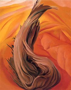 |
| Summer Days. (1936). Oil on canvas. | Stump in Red Hills. (1924). Oil on canvas. |
O’Keefe’s work exemplifies the complex relationship between the Abstract and the Representational. Summer Days is clearly a Landscape, the skull and antlers naturalistically portrayed. But are those curved lines Organic or Geometric? Those small eruptions of primary colors—red, yellow, blue—do they depict flowers and sky or eruptions of Form? And how about that red stump twisting out of red hills? Is it s naturalist’s study of desert environment? Or is it a painter’s exercise in hot color that matches the heat of the desert? The good news is that we don’t have to choose. O’Keefe’s compositions lead us down paths that turn back and lead us in multiple directions. Art is never about an Either/Or choice!
An Ominous Vision of the Future
In 1909, the Italian poet Filippo Marinetti issued an avid manifesto proclaiming independence from the past. His notion of Futurism rejected all traditions of the past and called for a dynamic, explicitly violent tearing of a new world out of the old. I.e. the Modern.
from Filippo Marinetti. (1909). Futurist Manifesto
1. We intend to sing the love of danger, the habit of energy and fearlessness.
2. Courage, audacity, and revolt will be essential elements of our poetry. …
4. We say that the world’s magnificence has been enriched by a new beauty: the beauty of speed. A racing car whose hood is adorned with great pipes, like serpents of explosive breath—a roaring car that seems to ride on grapeshot—is more beautiful than the Victory of Samothrace.[1]
5. We want to hymn the man at the wheel, who hurls the lance of his spirit across the Earth, along the circle of its orbit. …
7. Except in struggle, there is no more beauty. No work without an aggressive character can be a masterpiece. Poetry must be conceived as a violent attack on unknown forces, to reduce and prostrate them before man.
8. We stand on the last promontory of the centuries! … Why should we look back, when what we want is to break down the mysterious doors of the Impossible? Time and Space died yesterday. We already live in the absolute, because we have created eternal, omnipresent speed.
9. We will glorify war—the world’s only hygiene—militarism, patriotism, the destructive gesture of freedom-bringers, beautiful ideas worth dying for, and scorn for woman.
10. We will destroy the museums, libraries, academies of every kind, will fight moralism, feminism, every opportunistic or utilitarian cowardice.
[1] Victory of Samothrace: i.e. the Hellenistic sculpture of Nike, the Greek god of victory, a favorite attraction at the Louvre in Paris.
Marinetti’s statement encapsulates Modernism at its most militant. It inspired artists in Italy and the Vorticists in England. Boccioni’s sculpture captures the dynamic energy that Marinetti called for in a vaguely human figure thrusting forward.
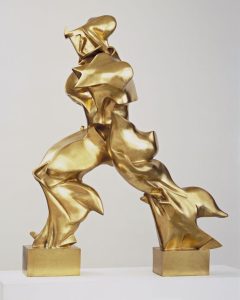 |
| Umberto Boccioni. (1913). Unique Forms of Continuity in Space. Bronze sculpture. |
Marinetti’s love for the beauty of speed” embraces the dynamic aspects of technology, especially the automobile. Ominously, its call for violence and war leads directly to the formation of the Fascist Party in Italy and the horrors that would kill millions of people in 20th Century wars that spanned the globe.
Vital Questions
Context
The Modern moment marks a watershed in the relationship between artist, work, and audience. Since the Renaissance, artists had been increasingly recognized as creative individuals, but their innovations had been held responsible to recognized principles of Convention. In the emergence of the Modern, artists broke free of the fundamental task expected of art, Representation, and claimed the right and capability of creating meaning out of the very stuff of art.
Content
What is art supposed to do? Traditionally, it represents and imitates a visual subject: the Form projects a Content as a Narration projects a Story. The early Moderns had stretched that relationship between Composition and visual subject to the breaking point. With the Abstract, the relationship is fundamentally severed. Abstract art erases the question of What is it? and drives viewers’ eyes back to the elements that comprise the image: Line, Shape, Form, Color, Texture, Composition. We want to move on to the subject, but the Abstract closes the representational door and demands that we be satisfied with Form.
Form
The thing is, Form is always at play. A Byzantine icon. Michelangelo’s Adam. Mona Lisa. Storm on the Sea of Galilee. The Starry Night. All carry us through Form and on to a signifying content. Yet the tools they work with are always the same: Shape, Form, Color, Texture, Composition. We can always ask Formal questions about art. Facing an Abstract, we are asked to focus on form as we might never have done before.
References
Abstract Art [Article]. (2004). Chilvers, I. (Ed.) The Oxford Dictionary of Art. Oxford, UK: Oxford University Press. https://www-oxfordreference-com.ezproxy.bethel.edu/display/10.1093/acref/9780198604761.001.0001/acref-9780198604761-e-13?rskey=C1A0Cq&result=3
Benke, B. (1995). Georgia O’Keeffe: Flowers in the Desert. Williams, K. (Trans.). Köln, GE: Benedikt Taschen.
Boccioni, U. (1913). Unique Forms of Continuity in Space [Sculpture]. New York City, NY: Museum of Modern Art. AN 231. https://www.moma.org/collection/works/81179
Elderfield, J. (Ed.). (2004). Modern Painting and Sculpture: 1880 to the Present at the Museum of Modern Art. New York: Museum of Modern Art.
Kandinsky, W. (December 1913). Light Picture. [Painting]. New York City, NY: Solomon R. Guggenheim Museum. https://www.guggenheim.org/artwork/1866
Kandinsky, V. (1926). Several Circles. [Painting]. New York City, NY: Solomon R. Guggenheim Museum. https://www.guggenheim.org/artwork/1941
Kandinsky, V. (February–March 1924). Yellow Accompaniment [Painting]. New York, NY: Guggenheim Museum. https://www.guggenheim.org/artwork/1941
Kandinsky, W. (1925). Yellow-Red-Blue [Painting]. Paris, FR: Georges Pompidou Center. AM 1976-856. https://www.centrepompidou.fr/en/ressources/oeuvre/cEpEKE
Kandinsky, Wassily [Article]. (2015). In Chilvers, I and Glaves-Smith, J. (Ed.s). A Dictionary of Modern and Contemporary Art (3 ed.) Oxford, UK: Oxford University Press. https://www-oxfordreference-com.ezproxy.bethel.edu/display/10.1093/acref/9780191792229.001.0001/acref-9780191792229-e-1348?rskey=hQs68i&result=9
Malevich, K. (1916). Suprematist Composition [Painting]. Tula, Russia: Tula Regional Museum of Fine Arts. WikiArt https://www.wikiart.org/en/kazimir-malevich/suprematist-composition-1915
Malevich, Kazimir. (1915). Suprematist Composition: Airplane Flying [Painting]. New York, NY: Museum of Modern Art. AN 248.1935. https://www.moma.org/collection/works/79269?classifications=any&date_begin=Pre-1850&date_end=2025&include_uncataloged_works=false&on_view=false&q=Malevich&recent_acquisitions=false&with_images=true
Malevich, Kazimir. (1918). Suprematist Composition: White on White [Painting]. New York, NY: Museum of Modern Art. ON 817.1935. https://www.moma.org/collection/works/80385?classifications=any&date_begin=Pre-1850&date_end=2025&include_uncataloged_works=false&on_view=false&q=Malevich&recent_acquisitions=false&with_images=true
Malevich, K. (1916). Suprematist Composition X. Private collection. Wikimedia Commons https://commons.wikimedia.org/wiki/File:Kazimir_malevich_suprematist_composition.jpg
Malevich, K. (1913). Woman with Pails: Dynamic Arrangement [Painting]. New York, NY: Museum of Modern Art. AN 815.1935. https://www.moma.org/collection/works/80381
Marinetti, F. (January 5, 1909). Manifesto of Futurism. Gazzetta dell’Emilia. Internet Archive. https://archive.org/details/FuturistManifesto/page/n1/mode/2up
Mondrian, P. (1943). Broadway Boogie Woogie [Painting]. New York: Museum of Modern Art. AN 73.1943. https://www.moma.org/collection/works/78682?classifications=any&date_begin=Pre-1850&date_end=2025&include_uncataloged_works=false&on_view=false&q=Mondrian&recent_acquisitions=false&with_images=true
Mondrian, P. (1922). Composition with Blue, Red, Yellow, and Black [Painting]. Minneapolis, MN: Minneapolis Institute of Art. AN 65.5. https://collections.artsmia.org/art/1595/composition-with-blue-piet-mondrian
Mondrian, P. (1930). Composition with Red, Blue, and Yellow [Painting]. Zürich, Germany: Zürich Museum of Art. WikiArt https://www.wikiart.org/en/piet-mondrian/composition-with-red-blue-and-yellow-1930
Mondrian, P. (1932). Composition No 10 [Painting]. Private Collection. WikiArt https://www.wikiart.org/en/piet-mondrian/composition-no-10-1942
Mondrian, P. (1929). Composition with Yellow, Blue, Black and Light Blue [Painting]. New Haven CT: Yale University Art Gallery. AN 1941.603). https://artgallery.yale.edu/collections/objects/43962
Mondrian, P. (1925). Tableau No. IV; Lozenge Composition with Red, Gray, Blue, Yellow, and Black [Painting]. Washington, D.C.: The National Gallery of Art. AN 1971.51.1. https://www.nga.gov/artworks/52614-tableau-no-iv-lozenge-composition-red-gray-blue-yellow-and-black
Mondrian, Piet [Article]. (2015). In Chilvers, I and Glaves-Smith, J. (Ed.s). A Dictionary of Modern and Contemporary Art (3 ed.) Oxford, UK: Oxford University Press. https://www-oxfordreference-com.ezproxy.bethel.edu/display/10.1093/acref/9780191792229.001.0001/acref-9780191792229-e-1804?rskey=b7tztg&result=7
Mondrian, Piet [Article]. (2015). In Chilvers, I and Glaves-Smith, J. (Ed.s). A Dictionary of Modern and Contemporary Art (3 ed.) Oxford, UK: Oxford University Press. https://www-oxfordreference-com.ezproxy.bethel.edu/display/10.1093/acref/9780191792229.001.0001/acref-9780191792229-e-1804?rskey=b7tztg&result=7
No.5/No.22. (2012). [Article]. WickiArt: Visual Art Encyclopedia. https://www.wikiart.org/en/mark-rothko/no-5-no-22.
O’Keeffe, G. (1921). The Black Iris [Painting]. Taos, NM: Georgia O’Keeffe Museum. AN 2007.01.019. https://collections.okeeffemuseum.org/object/148/
O’Keeffe, G. (1921). Blue and Green Music [Painting]. Chicago: Art Institute of Chicago. https://www.artic.edu/artworks/24306/blue-and-green-music
O’Keeffe, G. (1924). From the Lake No. 3 [Painting]. Philadelphia, PA: Philadelphia Museum of Art. https://artondemand.philamuseum.org/detail/482232/okeeffe-from-the-lake-no.-3-1924
O’Keeffe, G. (1926). A Street [Painting]. Taos, NM: Georgia O’Keeffe Museum. AN 1997.06.22. WikiArt https://www.wikiart.org/en/georgia-o-keeffe/street-of-new-york-ii
O’Keeffe, G. (1924). Stump in Red Hills [Painting]. Georgia O’Keefe: Biography, Paintings, and Quotes. https://www.georgiaokeeffe.net/stamp-in-red-hills.jsp
O’Keeffe, G. (1936). Summer Days [Painting]. New York: Whitney Museum of American Art. https://whitney.org/education/families/kids-art-challenge/georgia-o-keeffe
Strand, P. (October 1916). Pedestrians on Wall Street. Camera Work, v. 48, p. 25. Wikimedia Commons https://commons.wikimedia.org/wiki/File:Paul_Strand,_Wall_Street,_New_York_City,_1915.jpg
a technique which analyzes the visual subject, deconstructing it into fragmented, often geometrical forms that are reassembled into a densely inter-woven composition. A muted, narrow color palette focuses the eye on forms and composition that obscure the subject, depicted from several viewpoints at once
art that strives to imitate as closely as possible the appearance of the “real thing”
a function of visual art which seeks to emulate a visual subject that viewers will recognize from a theoretical “real world.” Opposite: abstract or non-figurative art
in visual art, the arrangement of visual elements for expressive and aesthetic impact: unity, proximity, similarity, variety and harmony, emphasis, rhythm, balance, etc
the material projected by art for the reader’s mind and imagination. Content can consist of an immediate Subject—e.g. a figure in a painting or a story in a narrative—and Signification, a secondary level of thematic meaning that opens up beyond the immediate subject of art or literature
visual art that makes little or no effort to represent any recognizable subject and appeals to purely aesthetic sensibilities
the dimension of an artistic experience that appeals to or challenges an au-dience’s sense of taste and experience of beauty, ugliness, the sublime, etc. A response distinct from “interested” concerns such as ideology, sexuality, social conflict or economics
a dimension of visual art that projects the artist’s inner vision outward, often distorting the subject in “unrealistic” ways
in visual art, the elements that comprise the composition irrespective of any representation of a visual subject: line, color, form and shape, value, texture, space, and movement
in visual art, a 2-dimensional path through space including length but not width or depth. Line may be straight or curved, directly drawn or implied, e.g. lines of sight, suggested lines of movement, etc.
in visual art, a two-dimensional figure with a more or less defined border displaying only height and width
a visual subject’s quality or wavelength of light. Three primary colors—red, yellow, and blue—combine to form secondary hues: orange, green, purple. Complementary colors create enhanced aesthetic resonance when placed against each other. Components of color include Hue, Value, Saturation (intensity) and Temperature.
(AKA Directional Line) lines, forms, and arrangements that organize a visual composition in vertical, horizontal, or diagonal directions
a secondary level of thematic meaning that opens up beyond the immediate subject of art or literature. E.g. the keys held by the figure of St. Peter in a Christian icon signify Christ’s promise that Peter would hold the keys to heaven and earth (Matthew 6.19).
in visual art, an equilibrium achieved between unequal elements of weight and scale in a visual field or along off center vertical or horizontal axes: e.g. a large open space offset by a small but weighty form.
a sector of a visual composition that is filled with the weight and substance of elements of color, line, or form
a sector of a visual composition that seems empty, devoid of clearly defined and weighted visual subjects
the elements, patterns, techniques, styles and structures that comprise the composition without regard to subjects, meanings, or values
a style in the arts associated with the early 20th Century that emphasized formal design and the surface of the medium over any represented or narrated subject
in visual art, an irregular form such as a cloud or rocky terrain that suggests natural origin distinct from human artifice
the quality of visual art which seeks to imitate the look of a subject that viewers will recognize from a theoretical “real world”
a visual composition that represents outdoor scenery that may or may not include human structures. Often an exercise in perspective and depth of field, with receding zones: foreground, middle distance, and deep distance.
the “voice” which conveys a story to its audience: a dictating voice, a cinematic camera, a dramatic painting, etc.
a connected series of events and actions that play out in a world projected by a narration
